Welcome to the HTC theme of the week, a series where I spotlight a theme I’ve found in the HTC Theme app, from a user I follow, a recommended theme, or eventually ones I’ve made myself. The Themes app runs on phones with HTC Sense 6 or higher and has a huge gallery of user contributed designs with custom wallpapers, icons, sounds and more.
While browsing the HTC Theme app I find many great themes and often times they are designed by a the same few designers I’ve covered in this column before. So I count it as a blessing when I find a new designer to follow and that has themes I want to share with you! Such is the case this week although I’m covering two turquoise themes back to back, I had to squeeze a new designer into the mix.
Iewe theme pros
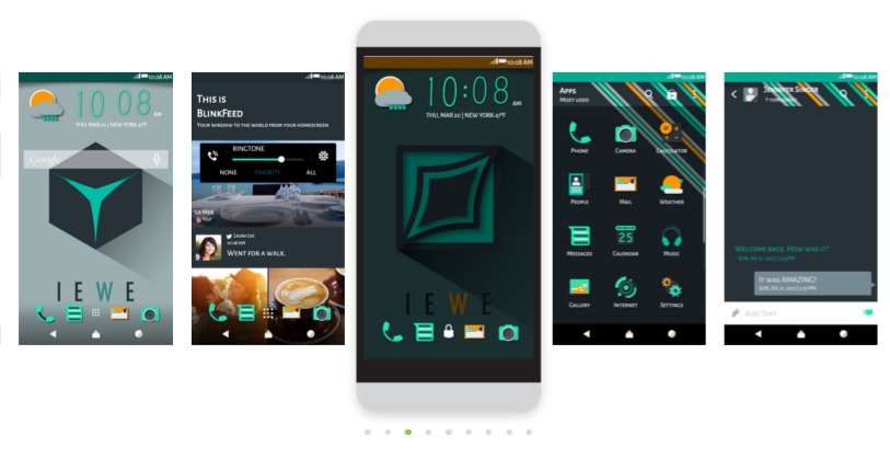
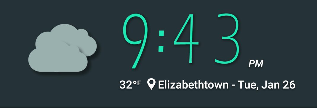
What initially attracted me to the iewe theme was the balance of colors on the main wallpaper. I typically don’t like bright wallpapers due to the old battery saving tip to avoid bright backgrounds, but I bent my policy for this one. The second thing I liked was the weather and clock widgets. The Zoe theme from last week was missing weather accents so I needed to reconnect with one of my favorite animated parts of themes.
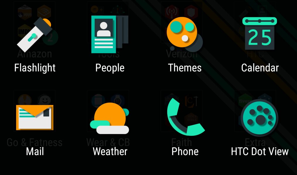
The app icon packs were great on the iewe theme as well. There were lots of custom icons beyond the basic HTC and Google apps and the remaining icons had a hexagonal shaped overlay. Great details!
The iewe theme has a couple of different wallpapers and the contact window and app drawer have different designs preventing the theme from feeling stale.
I could use this theme for longer than a week!
Iewe theme cons
Well, the one thing I found missing that I would like to see was audio clips for notification, ringtone, or alarm, but there’s lots of positives that outweigh this feature.
About the theme designer
Bohdan Nosa has nine themes approved in the HTC Theme app and today’s highlighted theme is his second latest design to land in the gallery. His original design is the only one that looks a little plain. The rest have an above average amount of details and are worth checking out.
About my theme review criteria
When selecting themes to review in this column I look for themes that are complete and look like they have a lot to offer.
So what does a complete theme look like?
A complete theme has a collection of wallpapers, as many custom app icons as possible with the rest styled and/or textured, custom weather and clock icons, custom soft keys, modified keyboard, custom fonts, and unique sounds.
That’s a lot of features, but to me, that encompasses a theme with all the bells and whistles. Not all themes I review hit all the marks, but they at least have several of the items mentioned above. I do this in an effort to show you the creativity of the designers uploading to the HTC Theme app.
Theme of the Week: iewe
Tapping the link above on your mobile will take you to a web browser and you may need to try the following item in order to see it in the Themes app:
- After you click on the link make sure you are *logged in at the top right and then tap the bookmark button near the middle of the screen. Then, on your phone open the Themes app and scroll to the right until you get to “MY BOOKMARKS” and the theme should be listed in there. *Make sure you log into the website using the same Google account used on your phone.
- If this doesn’t work for you, try searching for it in the Themes app: There is a search bar in the Themes app, tap the 3 stacked lines in the top left. Search will be in the grey bar across the top.
