As promised, I took a little excursion to the T-Mobile store over my lunch break to check out the new T-Mobile Dash 3G. They had just finishing setting up the demo unit as I walked in. I was a bit disappointed that they placed the security tether on the side of the screen, blocking nearly ¼ of the view. My wife currently owns the original Dash with Windows mobile 6.1 installed, so the UI was pretty familiar to me already. Holding the Dash 3G in my hand, it felt very similar to the old one, but the new styling, bigger buttons, and new trackball make the handset look a lot sleeker. I spent nearly ten minutes going over the new Dash 3G while trying to get the sales reps to buzz off.
A few thoughts on the new T-Mobile Dash 3G
- Form Factor – The new handset is very similar to the old Dash. This is a good things since the phone feels great in your hand. The new larger buttons on the QWERTY keyboard make typing even easier.
- Trackball – The Dash 3G’s trackball is eye catching since it’s the only white feature on a predominantly black and red handset. It works well for scrolling through menus and lists, but I wish it was more responsive and scrolled faster.
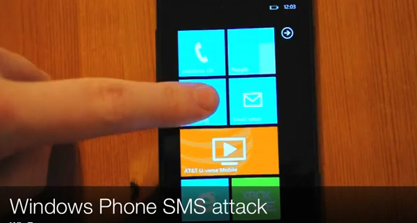
- Software – Windows Mobile 6.1 worked quite fine on the new Dash 3G. Unfortunately there was nothing new added. HTC did include additional software to take advantage of the new 3G and GPS chipsets. Telenav was pre-installed for GPS navigation and HTC’s YouTube app was present as well.
Overall, the T-Mobile Dash 3G is a great phone, but I’m a bit hesitant to say that it is a good replacement for the old Dash unless you really need 3G data and GPS. Now I just have to convince my wife that she doesn’t need a new phone just because it’s new and shiny.
