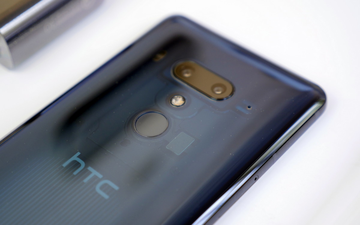
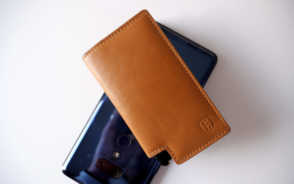
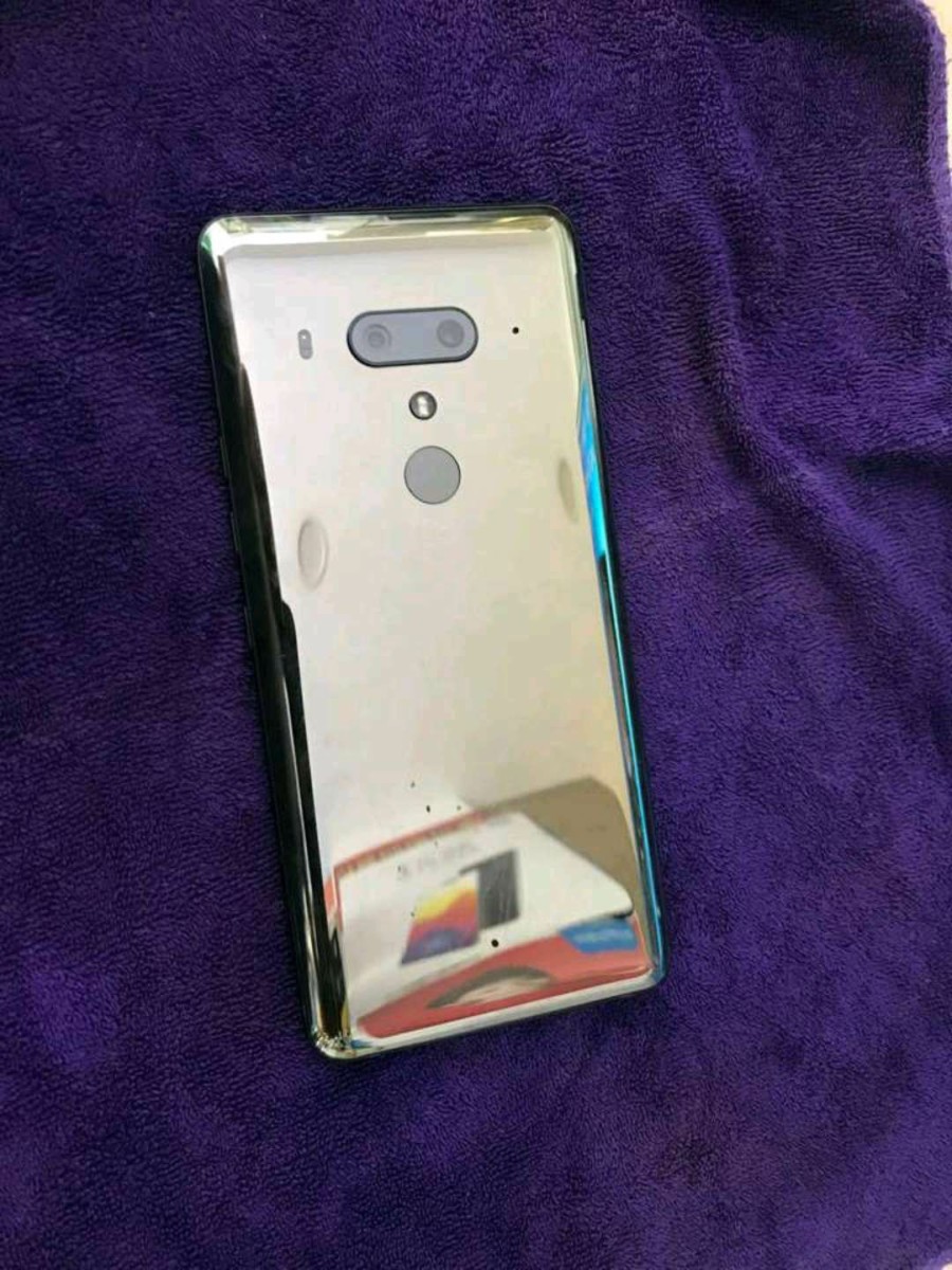
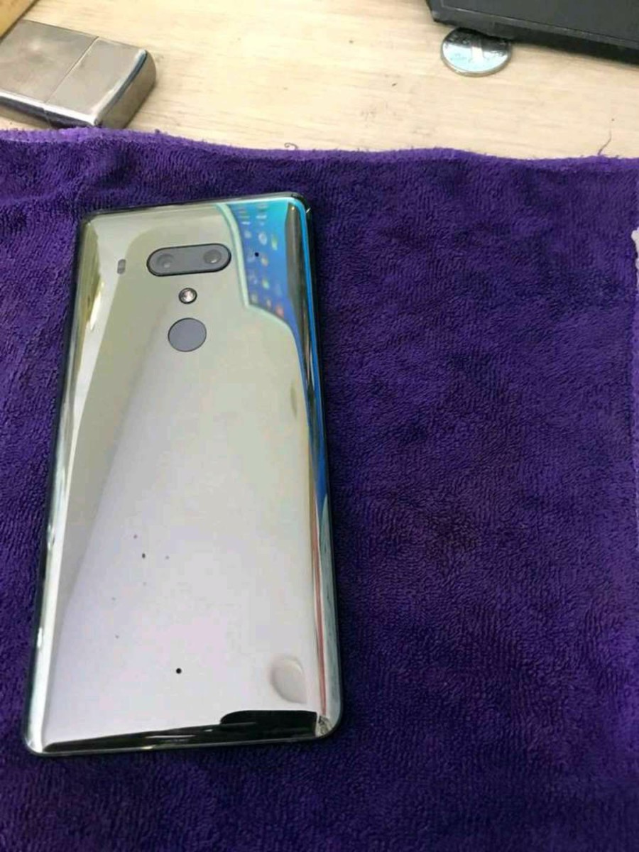
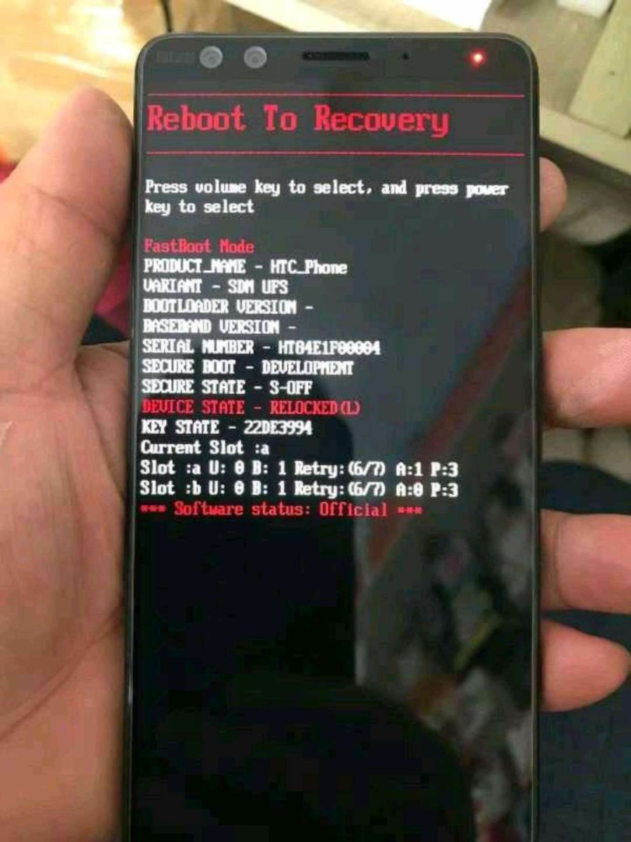
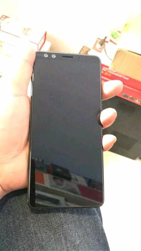
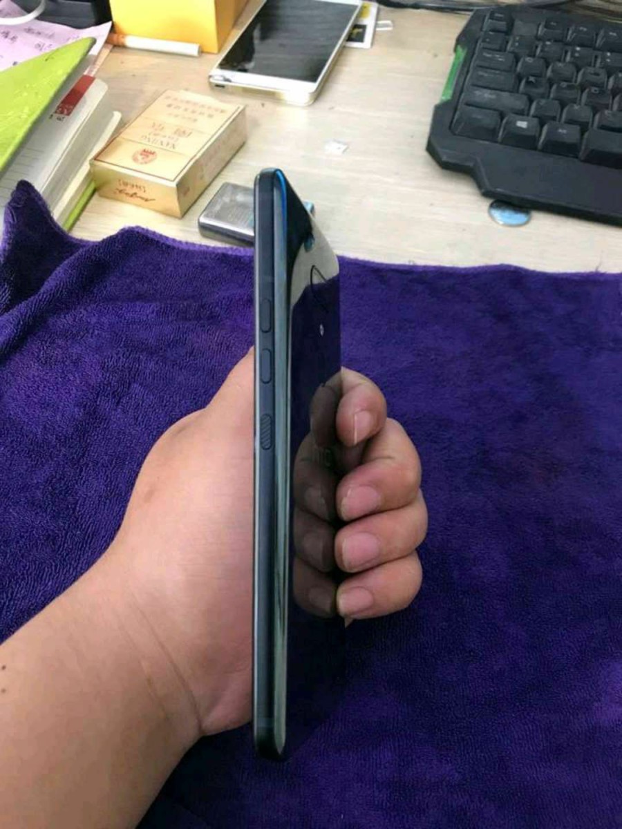
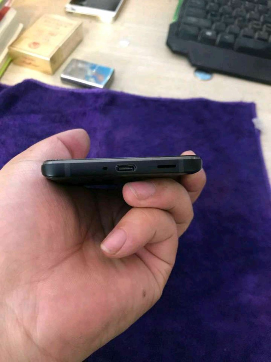
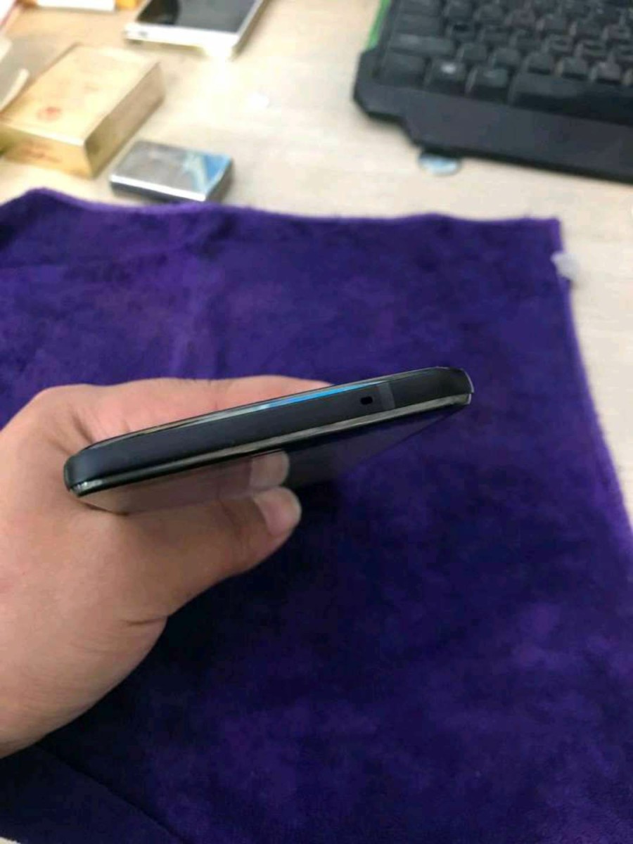
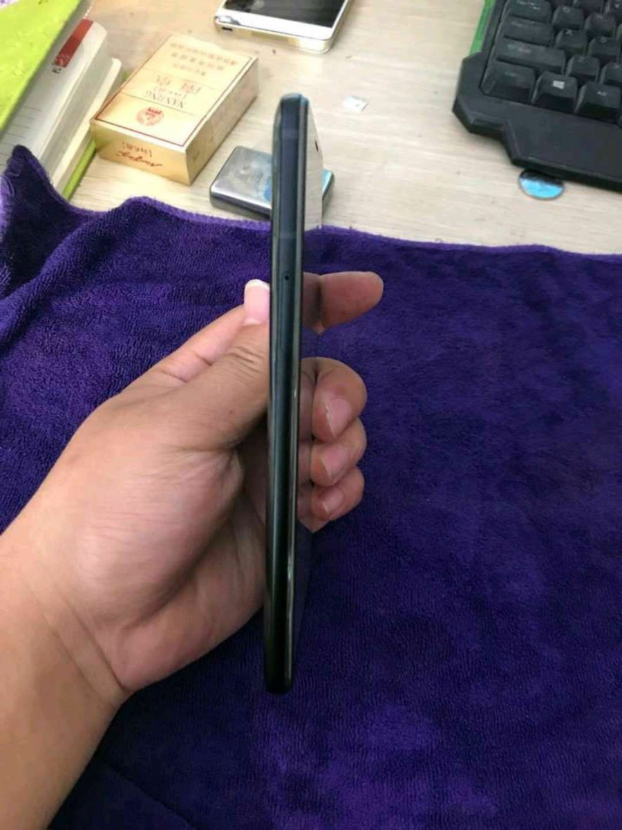
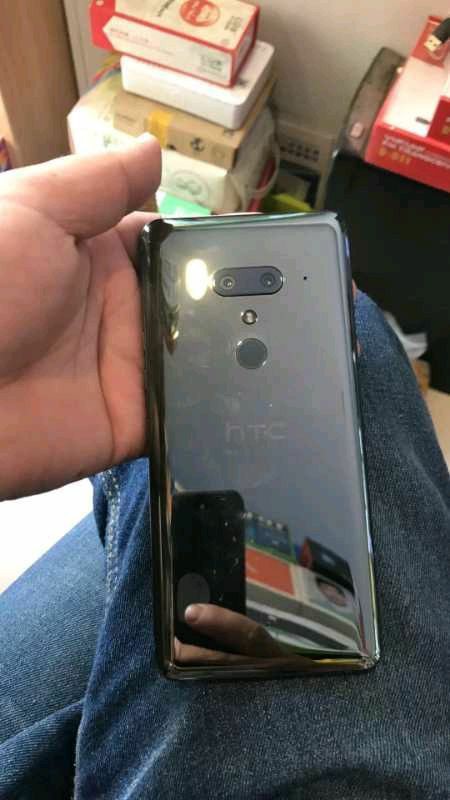
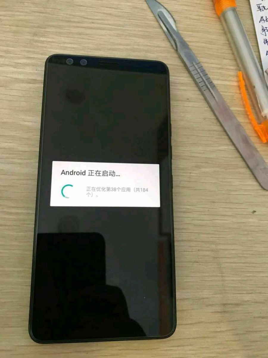
10 pictures of the HTC U12+ made an appearance of an HTC fan news page on Facebook today, showing off the phone from multiple angles and giving us a detailed look at what could be the final design of the phone. The HTC U12+ still doesn’t have an official launch date, but many are expecting HTC to send out invitations or the phone’s launch event within the next 10 days.
The design of the HTC U12+ looks to be similar to that of the HTC U11+ which made its debut last fall. The main difference is the dual-sensor camera modules on the front and back of the phone, the bezel at the top of the display appears to be a hair thinner and the volume and power buttons look to be much wider than they were on the U11 and U11+.
Personally, I’m not a fan of how the camera module on the back of the phone looks, but then again, the photos we’re looking at here aren’t the most flattering. What’s your take on the design of the HTC U12+?





It reminds me lg v30.
I would prefer a vertical cameras at the back
No headphone jack.. I’m out.
I don’t care about headphone jack at all! I don’t use my mobile for listening music and if I do the htc’s headphones are awesome, best in the market
I think the 6 inch phones are too big. 5.5 inch is the sweet spot.
Very disapointed…
Ridiculous that you either buy a big fckn wallpaper sized device or no up-to-date hardware for you buddy.