Smartphone release cycles are a bit puzzling at times. We typically see new generations of flagship devices from Samsung Sony LG and HTC make their debut in the first half of the year, but most of them also have mid-cycle release during the fall. This includes devices like the new Note 8 and the LG V30.
The issue though is that these new smartphones really aren’t that much better than the devices released in the spring. Typically, their distinguishing features include larger displays, beefier batteries and the latest version of Android – in other words, all the add-on features that should have been included in the flagship smartphone in the first place.
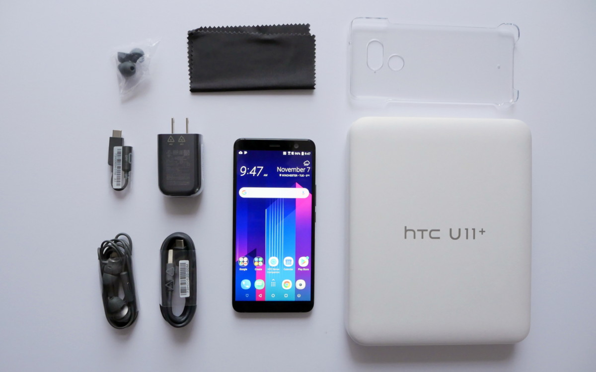
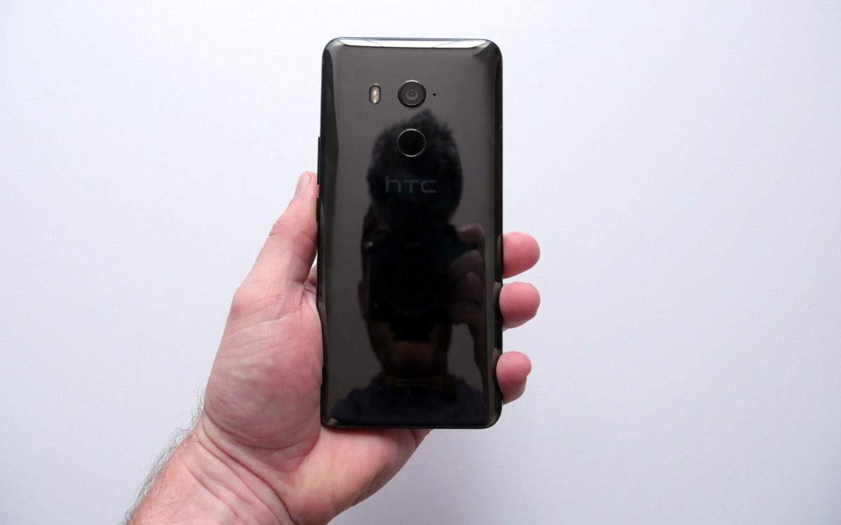
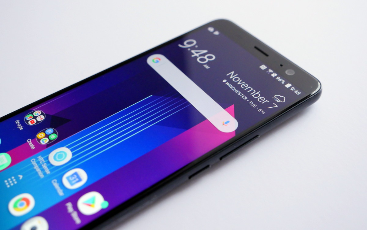
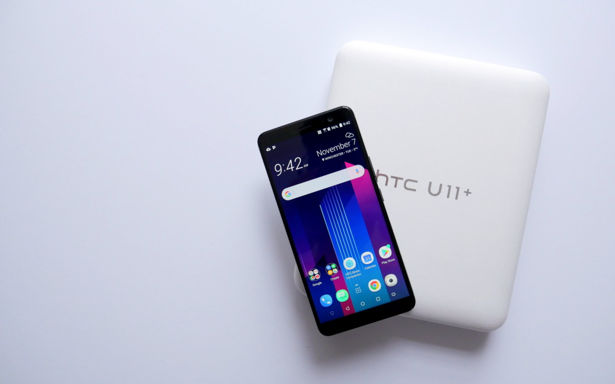
And that’s exactly what the HTC U11+ delivers. It has the same basic glass and metal body as the HTC U11, the same Snapdragon 835 setup and 4GB of RAM as is predecessor, and the exact same 12MP dual-pixel sensor as well. The only real difference is the U11+’s 6-inch 18:9 display and a massive 3930 mAh battery.
Simply put, the HTC U11+ is exactly what the U11 should have been.
Word on the street is that the internals of this phone are what HTC was working on with Google for the Pixel 2 XL before Google decided to jump ship and use LG to build the phone. Rather than scrap the project and cut its losses, HTC decided to breathe its own DNA into the design of the phone and gift us with one of the best smartphones of 2017.
Smartphone review protocol dictates that you wade through all the ins and outs of my 6-8 minute video before I share my conclusion, but I thought I’d start things off by letting you know that you should buy this phone. If you live in Europe or Asia and have been itching for a new device with a great camera, runs on Android Oreo right out of the box and can power through the most intense workday without breaking a sweat – the HTC U11+ should be at the very top of your list.
The base model with 4GB of RAM is incredibly fast, so I’ll assume that the experience on the 6GM model is even better. You can jump in and out of apps without them needing to reload. Since this phone runs Android oreo, you now get little notifications dots on your app icons. You can then dismiss the notification directly from there without having to pull down the notification shade. If you enjoy watching video on your device, there’s a new picture in picture feature so that you can watch your video while doing other things on your phone and then there are the new rich media notifications which change color based on the associated image to the media too are enjoying. HTC’s also recognized its settings menu to be more in line with what you get on stock android.
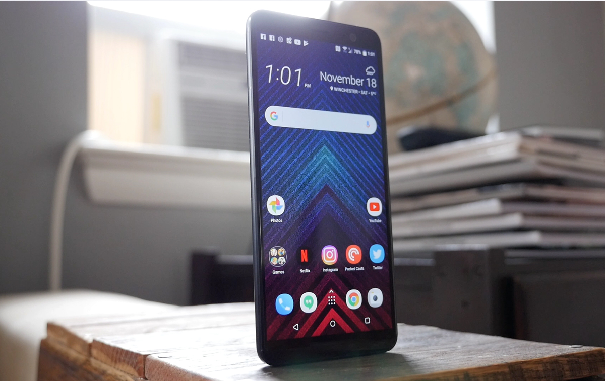
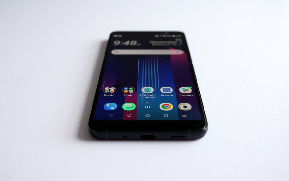
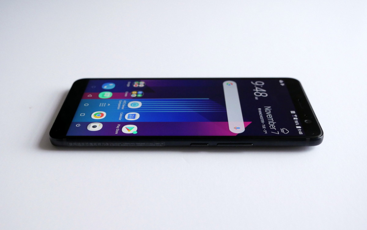
As far as new HTC software features go, you get a new HTC Sense launcher with easy access to the app drawer or notification shade with a swipe up or swipe down actions anywhere on the home screen. With the larger display, HTC’s also brought back on-screen navigation buttons. The layout can be customized and there’s even an option for a second panel of buttons with a swipe.
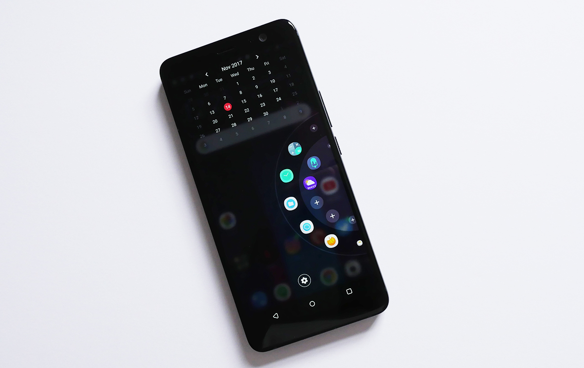
And then there’s the new Edge Launcher in combination with edge sense. The launcher gives you the ability to customize a list of shortcuts to your favorite apps, contacts of quick settings. The carousel layout is well executed, but since the edge sense squeeze actions aren’t triggered immediately, it’s) just as convenient to press the home button and choose the app you want to launch from there. Personally, I do enjoy edge sense quite a bit, but I think it’s best used to launch specific apps rather than using it as an alternative to the launch launcher.
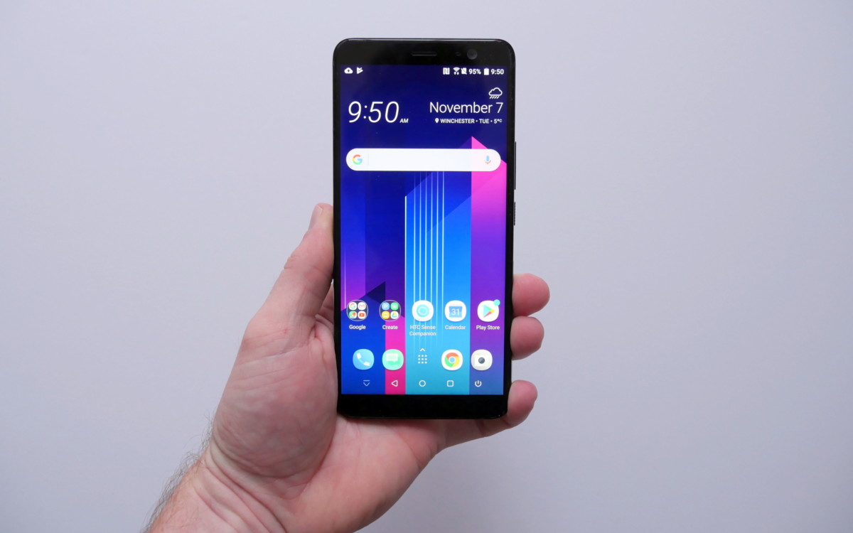
As mentioned before, this phone sports a massive 6-inch ultra-wide 18:9 display which is a first for HTC. The S-LCD 6 panel boasts a resolution of 1440 x 2880 pixels. The brightness can be bumped up so that it can be used comfortably in direct sunlight, but I also appreciate how dim it can get as well, letting off even less light than the OLED panels on the Galaxy S8 Note 8 – making it the perfect companion for late-night tweets in bed. The viewing angles are spectacular and you don’t get any of that color shift that we’ve all been hearing way too much about lately.
The overall size of the device is a little too large for my personal taste, but anyone who’s comfortable holding the Note 8, LG V30 or the Pixel 2XL shouldn’t have any issues with this phone’s size. HTC’s design team could have made it feel a little smaller by using 2.5D glass on the front rather than the flat Gorilla Glass 5 panel used here, but then again – this isn’t HTC’s true flagship smartphone – the U11 is.
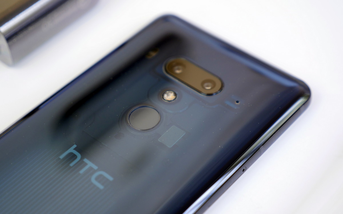
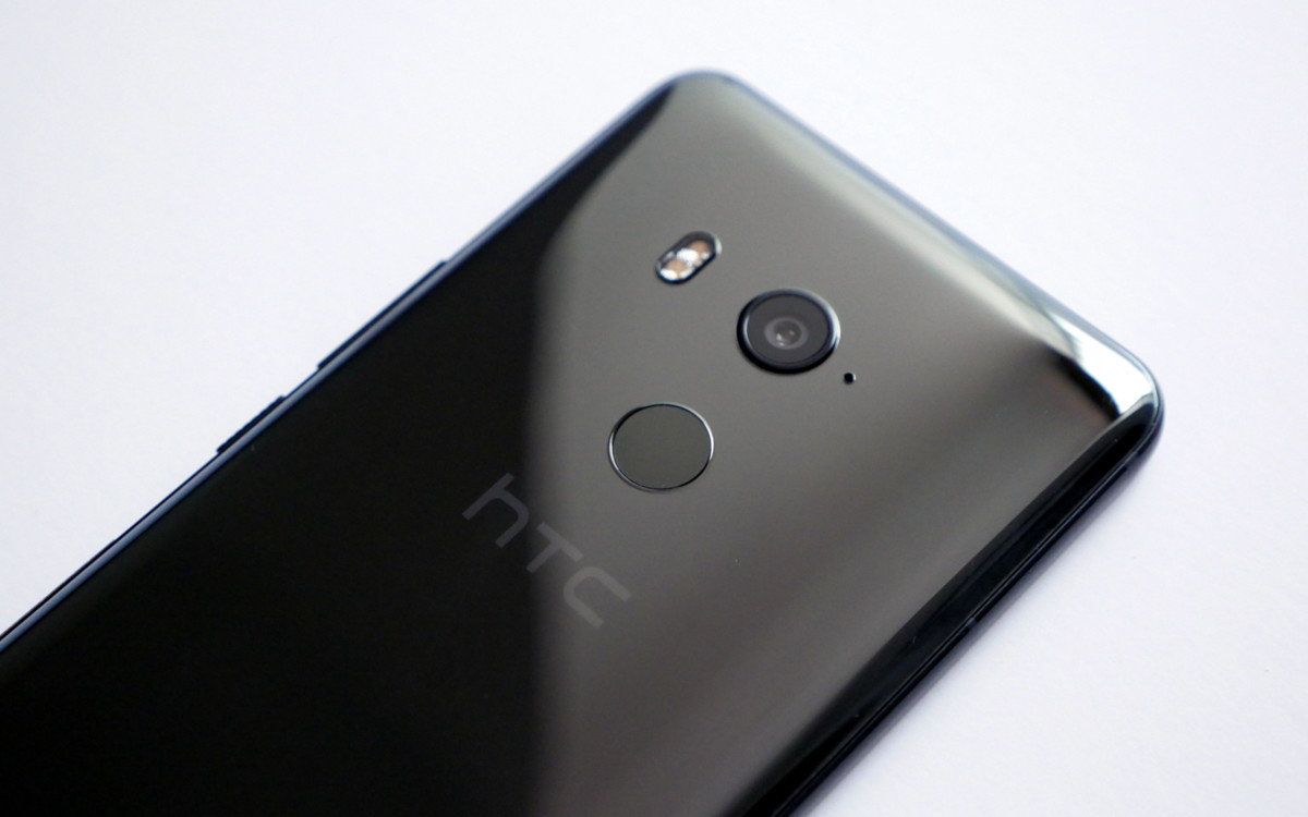
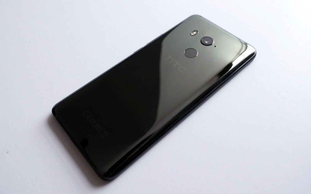
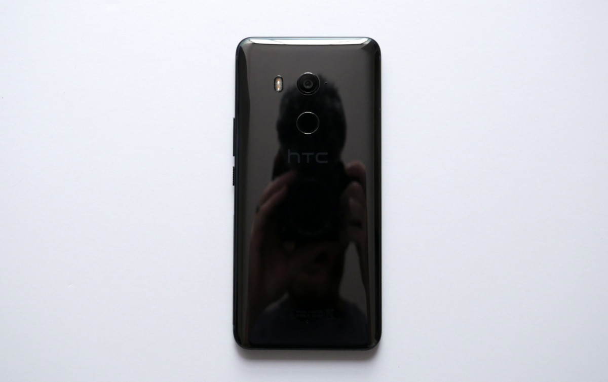
The phone has the same liquid surface design as the U11, but the added heft of the battery and taller display make this phone feel substantially larger. The only thing I’m disappointed with is that the black model I have doesn’t feature the translucent glass on the back. From what I’ve heard, that color option will be available in Taiwan before the end of the year, but it won’t make its way to Europe until early 2018.
To finishing things off, let’s talk about the cameras. The main 12MP sensor is paired with an f/1.7 lens and has OIS and phase detect autofocus. That setup is a one-to-one match with what you get on the U11. Needless to say, so are the results. The default HDR AUto setting delivers rich colors, impressive dynamic range, decent results in low light situations and camera apps itself is pretty good as well. The only issue I have is with blown highlights when lighting conditions aren’t perfect. Since it tries to deliver the brightest usable image possible, it often overcompensates in the brighter areas of the image, losing detail that you may have wanted to preserve. You can always easily tone down the exposure before taking the shot, but you really don’t know what the end result will be until it’s too late.
The front-facing 8M camera has a lower resolution sensor than the 16MP one used on the U11. The drop in resolution allows the pixels on the sensors to be larger for improved low light performance. The camera performs pretty well in pretty much all conditions and I do enjoy the wide angle lens since you can fit more in your shots.
There’s clearly a lot to love about the HTC U11+. If you already own a flagship device from 2017, you’re better off sticking with what you’ve got. But if you’re still holding on to a phone that’s more than 12 months old, there’s honestly no reason why you shouldn’t buy this phone. I can’t say that it’s the best Android phone on the market right now, but it’s definitely a contender for the crown.






















Great job!
I really love this U11+! Indeed it’s what’s the U11 should have been or at east the Pixel 2XL. It has many future features for the next U12, I’m planing to get that one in 2018!
Wel done HTC! The only thing they need to do now is rethink their marketing strategy!
I too will wait for the U12 now that finally have my finger print sensor working.
Darn MySprint app
I’d the U11+ was available in the States I’d definitely upgrade.
Great article 2 thumbs up
hello, I’ve seen this review, and I’ve also seen all your u11 + and I did not find that you spoke badly about the brightness of the screen outside or the battery as they have done there, according to your experience with the phone, it’s as they say there?
regards
https://www.gsmarena.com/htc_u11_plus-review-1690.php
Hi Nick what do you think of the very average battery result that GSMARENA got on their review of the U11+ ?
Thanks