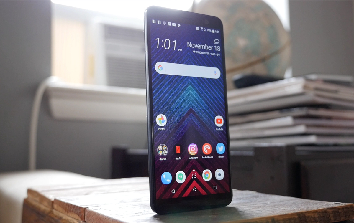
The image below was shared by @evleaks today, claiming to show off the front of the upcoming HTC One M10. As expected, the device shares a lot design elements with the HTC One A9 which was released towards the end of 2015. That being said, the device in the image is distinctly different mainly for the fact that it does not have an HTC logo below its display. HTC fans have been asking for this design tweak for years and it looks like the HTC One M10 may finally do away with the “black HTC logo bar.”
While the speaker slit and front-facing camera appear to be a little beefier than those on the One A9, the 2.5D glass on the front, antenna slits in the gold aluminum body, volume toggle and power button are pretty much identical. That being said, the M10 appears to be using a different fingerprint sensor below the display that is taller and less wide.
We still have no clue what the back of the HTC One M10 will look like. As with the front, it will likely share many design traits with the One A9, but we’re hoping that HTC has a few additional tweaks which will make the M10 stand out in a crowd.
What’s your take in the leaked HTC One M10 picture?
Source: @evleaks








No boom sound ? The core of HTC ? Next year maybe ! Again with my M7… Time will kill you HTC :s
Again with Evan Blass?
Fool me once. Shame on you.
Fool me twice. Shame on me.
Power buttons on the side and no boomsound will absolutely remove it from consideration. At least with the Power on the top and boomsound, the only real change the M8 an M9 needed was a vastly improved camera.
May I ask why you prefer the power button on the top? It was a good location for the power button when phones only had 4.3-inch displays, but it would be awkward on a device with a 5.1-inch display. If you read most M8 reviews, the phone got docked by pretty much everyone for placing the power button on the top.
After going from the EVO LTE (button on the top), to the LG G3, and now a Nexus 6P, I really have no liking for buttons on any side of the device for the sheer reason that I always happen to accidentally hit one of them taking the phone out of my pocket, picking it up off a surface, etc.
The EVO LTE I would hit the volume buttons still, LG has it perfect with the buttons all on the back right where the index finger naturally falls. Never do I accidentally hit the button, and paired with tap to wake, there is never an issue with accessing the phone in hand, or on a surface.
The Nexus 6P, while fixing a lot of the software headaches and having improved hardware, brought with it the terrible side power and volume placement that I hit almost every time I pick up the device. Easily accidentally launching the cameras, almost or actually force shutting off the device, and changing volume or skipping tracks of music is playing. The Tap to Wake and rear mounted fingerprint button is great, but I have a much harder time keeping the device off then getting access to it at any time.
My sister has an M8 for Windows, and the size with the power at the top really is a non issue as you are able to comfortably pick up the phone, grip it, and use the index finger to power on or off as well as tap to wake as well. While I found the M8 a bit tall, and the LGG3’s screen at the time was the kicker for me, the power button placement should not be a downfall of anyone has used a phone with it on the side.
Didn’t know you needed kung fu grip to hold a phone
I hope this is not the final product, doesn’t look very inspiring…. No front facing speakers would be a very big step backwards.
Read this article it is a ORIGINAL SOURCE and it’s said : Externally, the device’s appearance may still be subject to change, according to the person who used it. Therefore they were unwilling to comment in depth about its aesthetics. http://venturebeat.com/2016/01/28/htc-perfume-to-offer-qhd-amoled-display-laser-assisted-12-ultrapixel-camera/