Welcome to the HTC theme of the week, a series where I spotlight a theme I’ve found in the HTC Theme app, from a user I follow, a recommended theme, or eventually ones I’ve made myself. The Themes app runs on phones with HTC Sense 6 or higher and has a huge gallery of user contributed designs with custom wallpapers, icons, sounds and more.
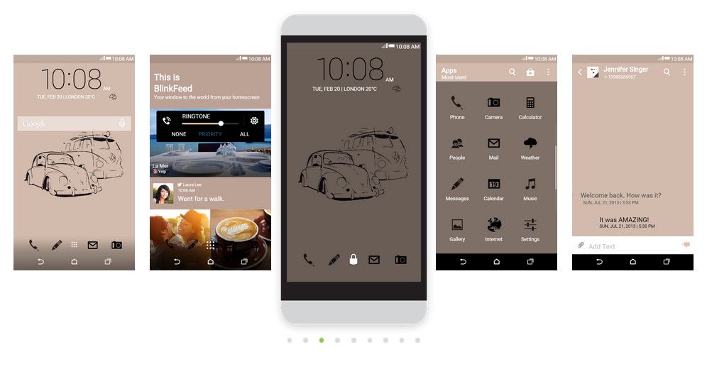
The black watch theme I’m going to cover today is different than others I’ve reviewed before. This theme has an attractive wallpaper and dark color scheme, but it fell short when added to my HTC One M8.
Black watch theme pros
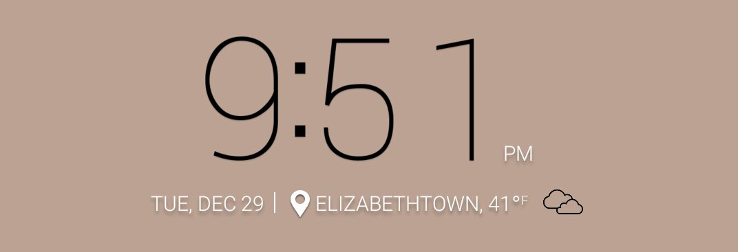
This theme has a cool tan color on the background with a decent sketched theme of two lowered VW’s. The HTC Clock has thin dark numbers for a simple look. And that’s about it for the pros.
Black watch theme cons
I gave this theme a shot mostly, because I wanted to see the potential of other designers, but it fell short of my expectations and I’ll explain why.
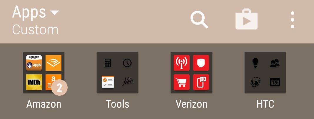
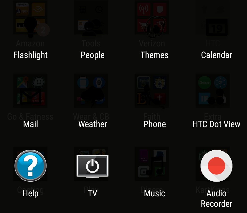
On the theme preview page in the HTC Theme app or website the icons contrasted well, but when I applied it to my One M8 I had some trouble viewing the icons. As you can see in my folders the apps are visible, but as soon as I open the folder the icons disappear. This is a tiny oversight most designers run into using icon designs with a lot of black. Users that have folders anywhere on their phone will not be able to see the icons very well.
If the app icon shortcuts on the bottom of the home screen are common like the phone or camera icon, they can get lost in BlinkFeed when they land on a dark preview picture in the news feed.
Aside from the minor design flaw with the icons, there are the things missing from the criteria I look for when reviewing a theme. I really like to see a custom weather icon set, but that was missing with the black watch theme. I overlooked it for the sake of the wallpapers, but the theme started to feel dull after a while. Also missing was any custom sounds so my phone still rings to the tune of sleigh bells from my last theme of the week.
About the theme designer
Elena Buz only has three themes in the gallery and this theme was most likely her first. I browsed them quickly and know that I will not be interested in them since one of them boasts in the description that the weather icons are transparent which means I’ll have a hard time finding the quick tap feature I use often to check the weather.
The black watch theme was added in early November and has been downloaded 3080 times so far. Try it if you’d like. The experience with a newer HTC phone might be better since I did notice a custom picture in the caller window.
About my theme review criteria
When selecting themes to review in this column I look for themes that are complete and look like they have a lot to offer.
So what does a complete theme look like?
A complete theme has a collection of wallpapers, as many custom app icons as possible with the rest styled and/or textured, custom weather and clock icons, custom soft keys, modified keyboard, custom fonts, and unique sounds.
That’s a lot of features, but to me, that encompasses a theme with all the bells and whistles. Not all themes I review hit all the marks, but they at least have several of the items mentioned above. I do this in an effort to show you the creativity of the designers uploading to the HTC Theme app.
Theme of the Week: black watch
Tapping the link above on your mobile will take you to a web browser and you may need to try the following item in order to see it in the Themes app:
- After you click on the link make sure you are *logged in at the top right and then tap the bookmark button near the middle of the screen. Then, on your phone open the Themes app and scroll to the right until you get to “MY BOOKMARKS” and the theme should be listed in there. *Make sure you log into the website using the same Google account used on your phone.
- If this doesn’t work for you, try searching for it in the Themes app: There is a search bar in the Themes app, tap the 3 stacked lines in the top left. Search will be in the grey bar across the top


