Changing the appearance of our phones is something that everyone has done at one point or another. Even if only to change the wallpaper. There are all sorts of things a user can do to set a phone apart from the others and to get a unique interactive experience. Aside from changing wallpapers, ringtones for notifications, alarms, phone calls, and text messages the HTC One M8 gives you the ability to change the color palette found throughout the HTC Sense user interface.
HTC Sense has been around Android for a long time and even in the early days it offered various flavors of “themes” for users to apply. My favorite was back when you could set a theme that applied to the type of environment you were in. For instance, if you were at work you could apply a theme that had a focus on productivity and a professional interface, like wood grained. Or if you were at home trying to tune into your favorite social networks you could switch to a social theme that had social friendly widgets for catching up with your friend’s activities.
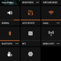
Today’s theme on the HTC One M8 isn’t as custom as the good old days, but these themes do have a unique ability to change the color palette affecting things like, BlinkFeed, quick launch settings in the notification tray, Settings, and the apps button on the quick launch buttons at the bottom of the home screen. There is an accompanying wallpaper to go with each Theme, but you have an option to keep your current wallpaper when switching themes.
Here’s what you need to do to change the theme on your HTC One M8 or other HTC device running HTC Sense 5 or above.
- Go to Settings
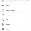
- Scroll down and tap Personalize
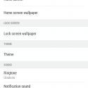
- Tap Theme
- Tap one of the four themes (your current theme will have a check mark on it)
- Tap Apply
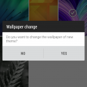
- Select “No” or “Yes” to change the wallpaper of new theme
After you select a new theme, HTC Sense will take a few seconds to relaunch with the selected theme. As briefly mentioned above, there are only four available themes to choose from which leaves plenty of room for improvement. We hope that HTC would consider adding more themes and releasing them as part of a service pack downloadable from Google Play.





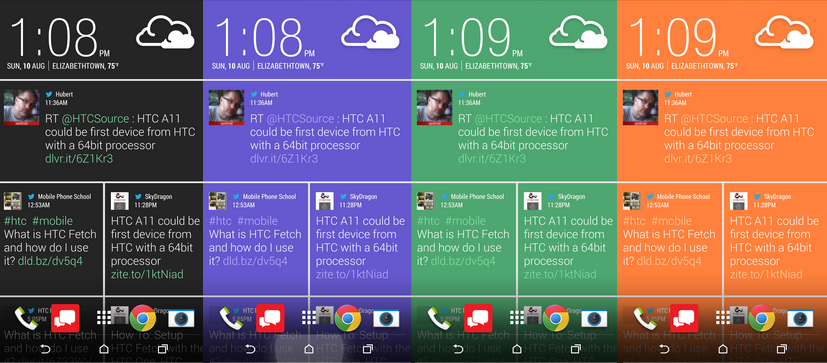

As a graphic designer, I feel visually Sense 6 is a big step down from Sense 5. The themes look cartoonish. There are only four to choose from and the so-called monochromatic theme has lots of green and some red peppered throughout. It’s sloppy. Sense 5 & 5.5 had a largely black and white feel. It looked clean, it looked professional. Sense 6 reminds me of Touchwiz, which is one of the reasons why I avoided Samsung and chose HTC in the first place.
I hope HTC offers some new themes and fast. I’ve already pulled my SIM out and plugged it into an old Nexus device. Maybe that’s the best way to go moving forward.
The black & white theme is just like sense 5 throughout…. I prefer color
It’s not just like Sense 5. There are green accents littered all over the place. The volume bar, mail app menus (which also contain red), the keyboard, music player, contacts and dialer. Pretty much any HTC app. It’s inconsistent and just plain poor design.
Ive also complained about consistency within sense (Sense 5 setting icons in power off menu, stock android menu in blink & home screens) but sense 5 had blue accents through out
I know what you mean. What’s sad is that is still the case with Sense 6. It reverts to stock android menus (black/blue) for certain things. When deleting files for example. Only now in Sense 6 it’s worse because on top of the blue/black randomness, we have green and red to deal with everywhere. So cheap and ugly looking.
Great tip! Much appreciated.