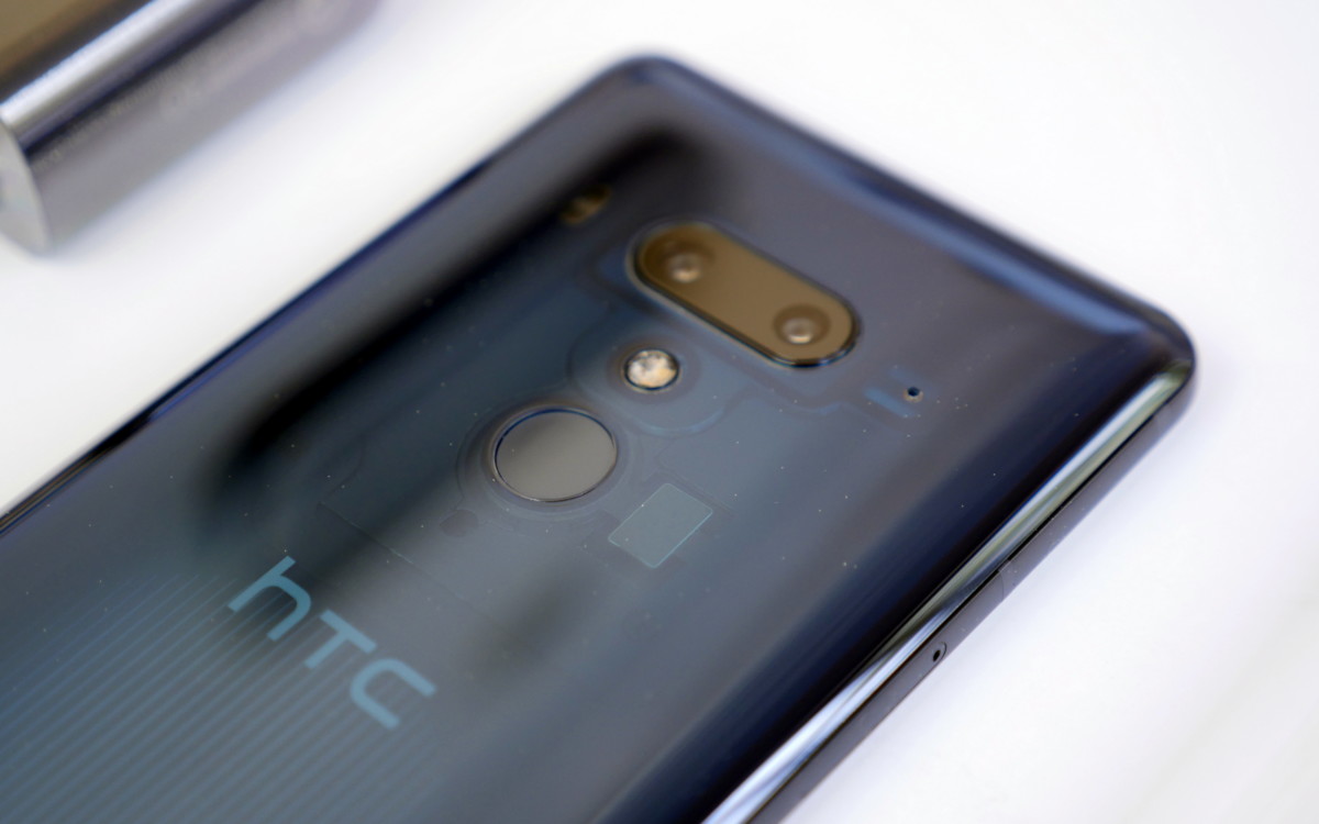
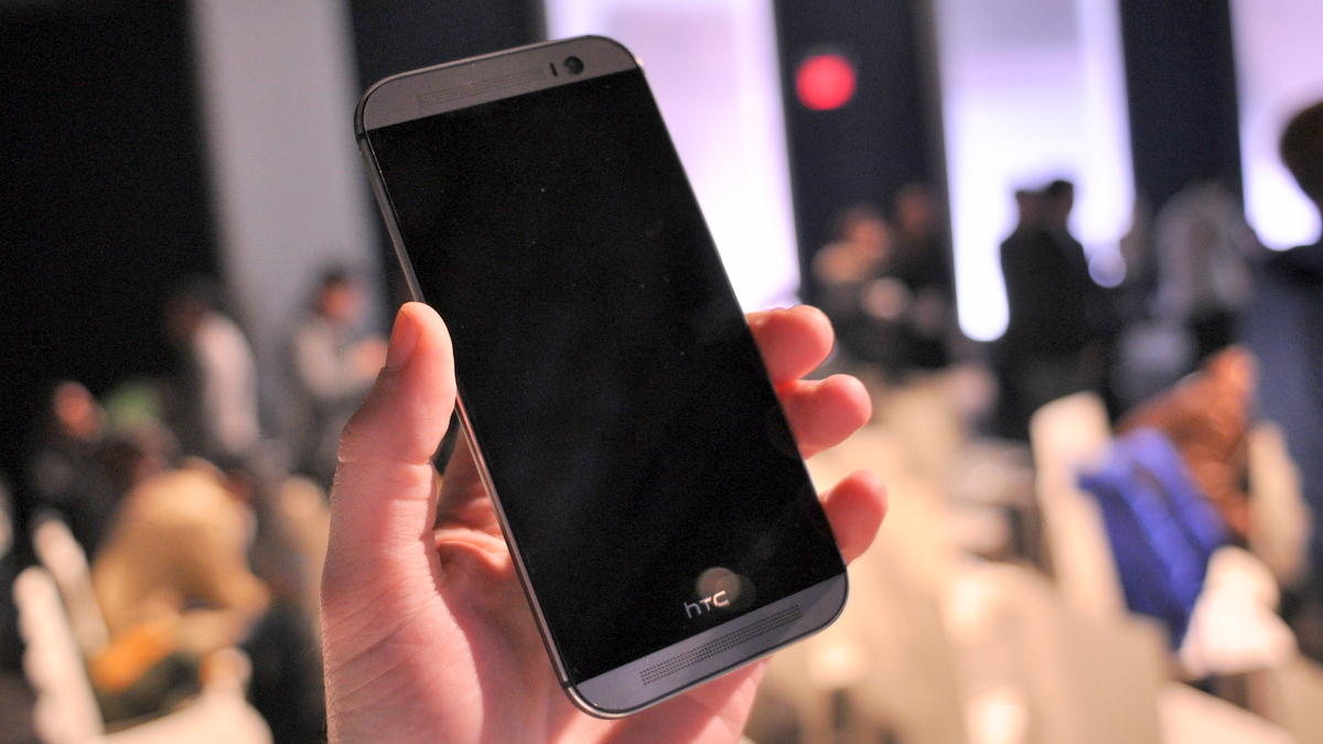
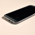
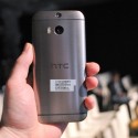
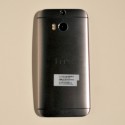
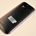
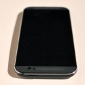
Compared to the 2013 HTC One, HTC’s new flagship feels like a completely different device. The 2014 model is larger, slightly heavier and its new curves allow it to settle more comfortably in the palm of your hand. The brushed aluminum finish on the back of the all new One is extraordinary – something we have never experienced on another smartphone. As you might expect, the Duo Camera on the back of the HTC One (M8) does look awkward at first, but it’s not half as bad as what it look like in pictures or video.
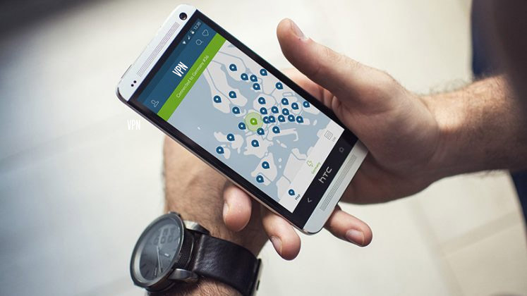
HTC has set the bar pretty high with HTC Sense 6. The home screen UI looks very similar to HTC Sense 5.5, but HTC has worked very hard to improve interactions with its software – eliminating many extra button presses and unnecessary UI elements which didn’t really add anything to the user experience. We were actually take aback by how flat the UI is compared to previous versions of Sense and other custom skins from the likes of Samsung, Sony and LG.
BlinkFeed has more than a dozen new feature, allows third-party apps to integrate their information directly into the feed so that you can view the score of a game you’re following or track your daily steps from your fitness tracker without having to open a dedicated app. HTC has opened BlinkFeed up to third part developers, so we should expect to see different apps get integration with BlinkFeed in the coming months.
Video highlights and HTC Zoe are back and better than ever. HTC’s new enhancements give you more control over the creation and customization of your video highlights and Zoe can now …. in addition to capturing video clips and images at the same time.
Check out our hands-on video and pictures of the HTC One (M8) for more details and let us know what you think.






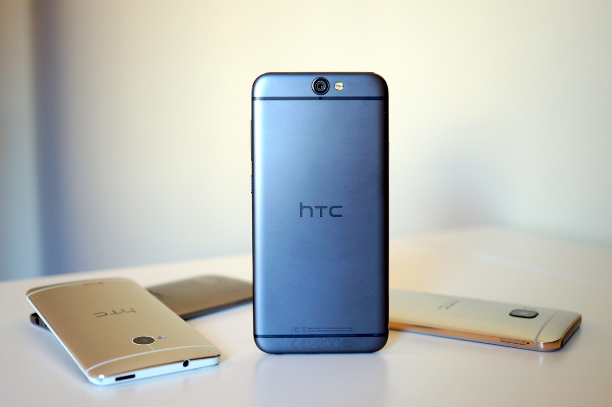

The camera failed to impress, especially with high expectations of it having one dedicated sensor to definition & low light & the other for detail. HTC could of utilized the dual sensors so much better than a new photography feature & Nokia proved you only need one sensor to refocus.