The All New HTC One (HTC M8) will be unveiled in New York and London on March 25. The phone will be the direct replacement for the 2013 HTC One which features an iconic full metal design which has been highly praised by handset owners and media across the globe. As you can imagine, the 2014 HTC One will always be directly compared to last year’s model, so HTC has decided to keep the main design elements of the 2013 HTC One and infuse them into its upcoming flagship device.
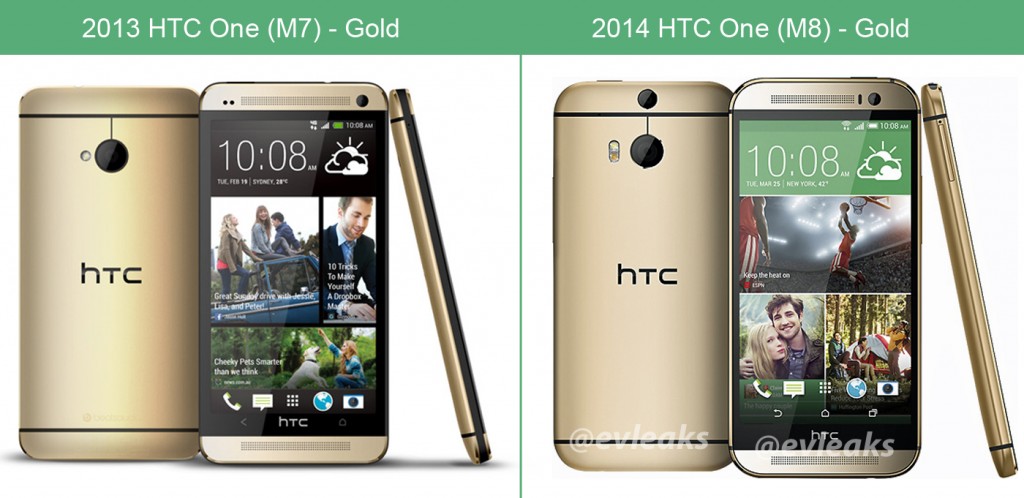
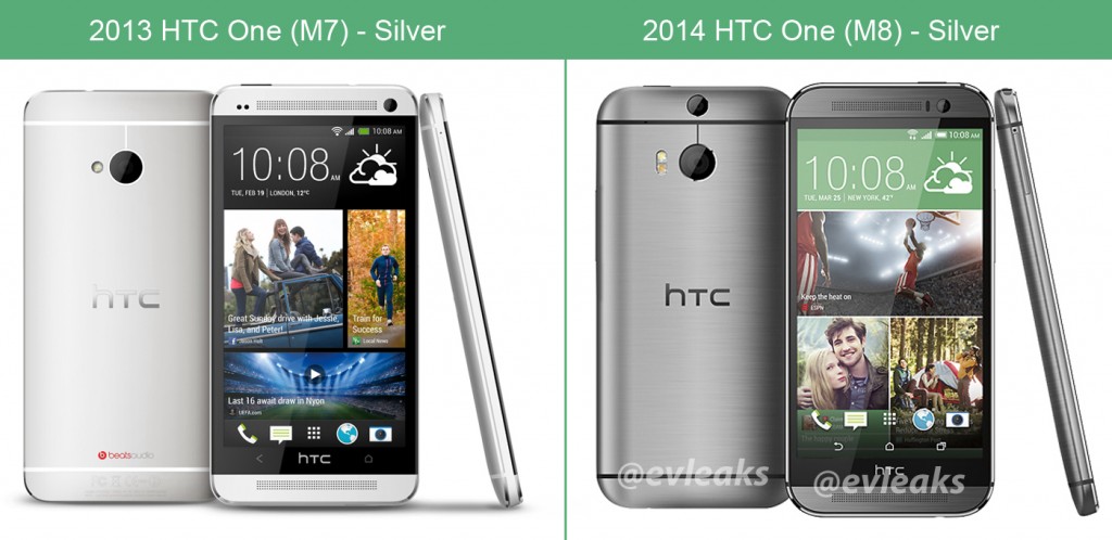
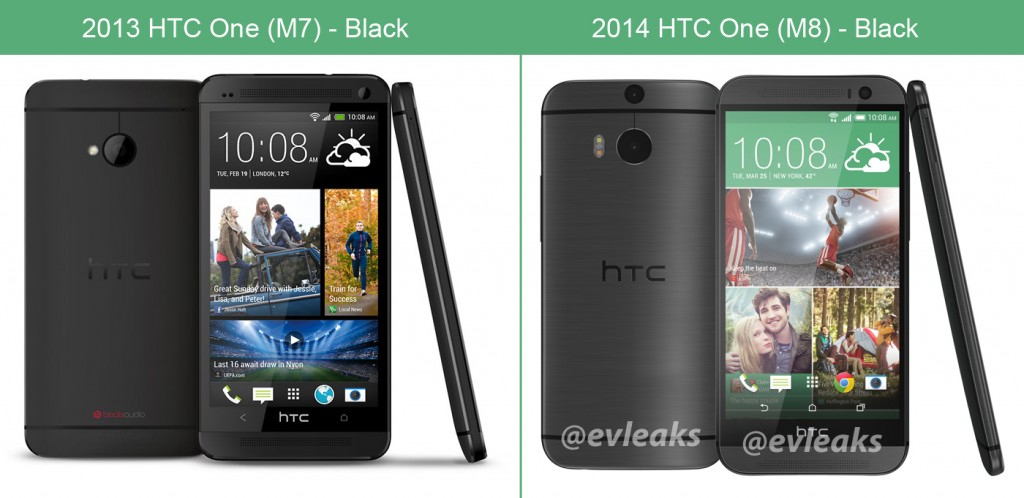
That being said, there are several distinct design elements which are different between the 2013 and 2014 models of the HTC One. The All New HTC One will no longer have chamfered edges and the symmetrical front-facing speaker of last year’s model have been tweaked slightly to make room for the proximity and ambient light sensors next to the front-facing camera. The most notable differences between the two models is the seamless aluminum shell of the 2014 HTC One which wraps around the back and sides of the device and the two camera setup on the back.
But rather than using words to point out the differences between the two phones, we’re taken the leaked silver, gray and gold press images of the 2014 HTC One and matched them up with their 2013 counterparts so that you can see the subtle design tweaks for yourself. Do you think the design changes between the 2013 and 2014 HTC One models are significant enough?






Simply awesome but that bezel with HTC logo is getting on my nerves.
What if the top ‘camera lens’ was actually a holographic projector that could project a large screen and the regular camera used to detect finger motion so you could essentially have a holographic touch screen? Oh, r2d2 holographic projections don’t exist yet? One can dream…
#htcخیلی زیباست
The design aesthetics are certainly a step down. Interested to see what the camera can do.
My first thought was they’re trying to make it look more like a metallic Galaxy S4. The slight bevel or border around the edges and more pronounced curves remind me more of the Samsung…