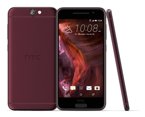
If the image of the All New HTC One didn’t exactly tickle your fancy, you may be more excited to see what the phone looks like in silver and gray. Thanks to @evleaks, we now have two more official press shot leaks of the 2014 HTC One, M8 or whatever you want to call it (we’ll be keeping the handset’s code name around until HTC gives us the official name).
We have not been able to find any noticeable differences between the silver, gray and gold press images of the All New One. The design of the 2013 HTC still looks better to us, but we know there’s a lot more to design than just looks. The HTC M8 is said to be slightly thinner with a more pronounced curved back than last year’s HTC One.
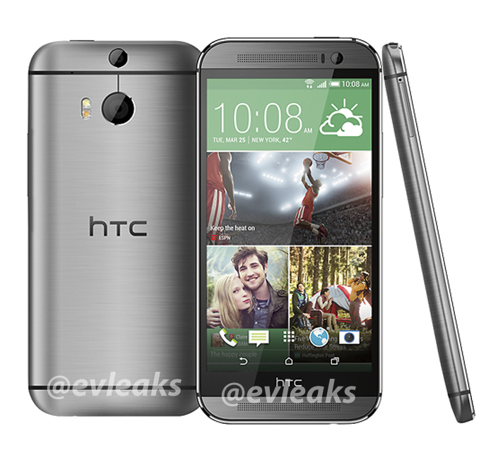
Source: @evleaks (1), (2)






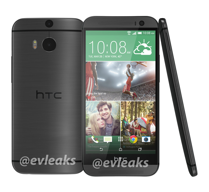
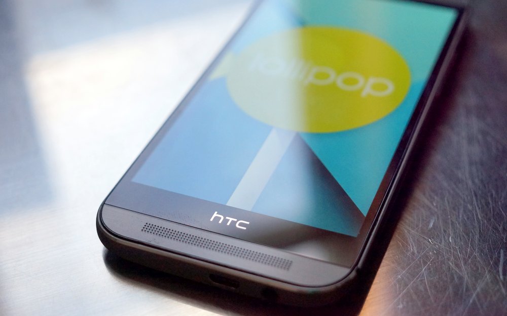
Man. I still can’t believe that’s the front design they went with. It’s almost perfect but the fact that they have that useless HTC band across the front pushes the dock row of icons almost 1/4 of the way up the phone. Imagine three lines, one that cuts it in half from the HTC logo on the back plate that goes across the screen, then imagine another cutting the bottom half again into fourths. The bottom 1/4 line would be just a little above the icons. That’s totally odd when I look at my Note 3 which has the top of its dock icons about 1/16th up the phone. Where most manufacturers are trying to make the most efficient use of their screen sizes, HTC has butchered their design and thrown efficency out the window.
This looks very classy didnt like newer shapes but looks art apart of Logo.
Lol
We really looking for problems wish change my wife not only logo issue.