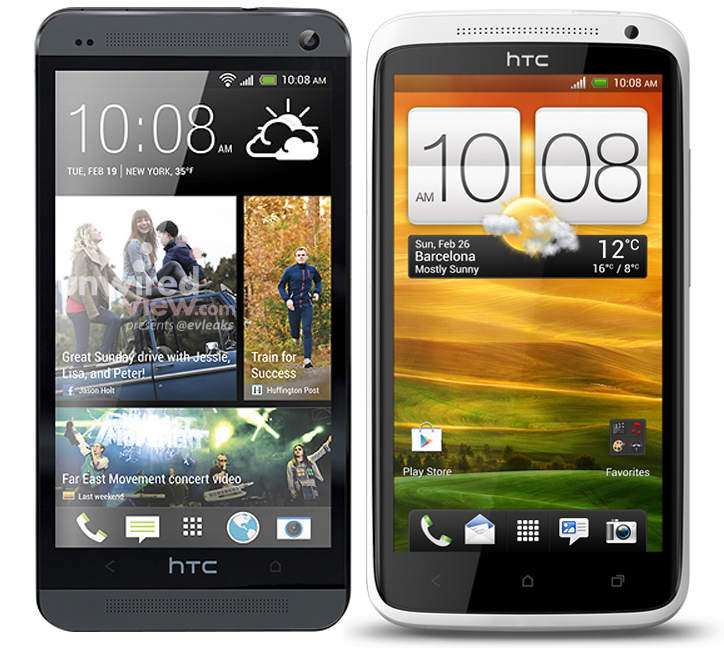
Last week we learned that the HTC M8 may be the first device from HTC to feature on-screen buttons. Thanks for an anonymous email, we now have an image which may show what those on-screen buttons will look like. The image above shows the standard back, home, and multi-tasking Android buttons. While the back button doesn’t match HTC’s current capacitive equivalent, the home and multi-tasking designs do. If HTC does choose to take the on-screen button approach with the HTC M8, it’ll be interesting to see how the app dock will look like in Sense 6.
As with all rumors and leaks, we encourage you to keep an open mind.
HTC M8 on-screen buttons compared to HTC capacitive buttons
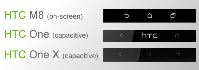
As we noted a few days back, if the HTC M8 does feature on-screen button with a thinner bezel around the display, the phone could be slightly smaller than the HTC One despite the fact that the M8 is rumored to sport a 5-inch display. Do you think moving to on-screen buttons with the HTC M8 is the right decision?
Source: Weibo (login required)





It’s feels like HTC lost his touch. This is stupid. HTC One X was better with the three buttons.
I do not think that they should make the screen smaller I like the screen size as it is now maybe even a little bigger
I dont know what is the problem for people with 2 buttons? you can set the home button as menu and multitask at the same time so there is nothing missing. anyway i think this is a good move. nowadays more producers use onscreen buttons but while comparing screen sizes almost nobody includes this fact but obviusly they take some place on the screen. I know that they hide in galery or when playing a video but I which they could hide also during browsing web.
I don’t understand why anyone would dislike this. On screen buttons are the most flexible form of buttons and also the quickest to respond. The HTC One’s layout, while not as terrible as many make it out to be, is much more difficult to use than on screen buttons. The best part about on screen buttons, though, is how they can disappear when you actually need the space, such as YouTube videos or gaming. So basically if the M8 has a 5 inch screen with on screen buttons, during normal tasks the available real estate will be 4.8 inches, and during videos and gaming the whole 5 inches. What could be better than that? It’s technically bigger than the screen we have now without actually making the phone bigger.
Noooooooooooooooooooooo
I don’t have program with cell size, but I HAVE on screen buttons! I had an HTC One X, and now one with on screen button, ad I hae it! you take a screenshoot, there he is! The on screen buttons on One X appeared in the first version even on game (that … button), which use a lot of space. I want a 1080p cellphone, not a 1000p one ¬¬”
Guys, you call yourself HTC Source and you didn’t know this was public information for more than 3 weeks now? And you don’t follow llabtoofer, the most well known HTC custom rom developer of ‘m all? http://llabtoofer.com/2014/01/07/htc-m8-all-in-one-information/
One of my major concerns….now that beats has been retained by dr dre n co….will the new M8 will have beats audio n headset…
it will not have the beats audio name however boom sound front-facing speakers will most likely remain
Htc one purple tint problem
The on-screen buttons would be great if the didn’t eat up the screen real estate. Why did they leave the bottom bezel so big and then put on-screen buttons?? They have turned a 5″ screen into a 4.7″ screen.
I wanted to buy a M8. After I saw these ugly buttons which stand opposite to the elegant design AND waste up screen space I decided NOT to buy an M8. Wrong decision.
This really pisses me off. WHY???? A massive fucking fly in a sweet ointment.
have you actually seen it in person? The bar is fully transparent on the home screen and follows google’s lead when in other apps.
I’ve had one for about 2 months, and it still annoys me. Just LOOK at the amount of space they use when in Chrome. It’s an eyesore, why couldn’t they just do what they did with the Gallery buttons and have a semi transparent background.
It’s up to the app developer to implement since it’s a code change that the developer has to add for Android 4.4. Check out this app, the action bar at the bottom and notification bar at the top are both transparent on the HTC One (M8).
https://play.google.com/store/apps/details?id=com.jonathannakhla.meetmehalfway
That’s exactly it. I still think it should be a system wide, customisable feature like screen brightness etc (although the kindle app seems to have its own brightness setting). Frustrating, as it would be so simple to implement, yet an extremely quick win for HTC, good PR too.
Just rooted my M8 and installed Auto Hide Soft Keys
https://play.google.com/store/apps/details?id=com.gmd.hidesoftkeys
Paid me 2 quid to upgrade to PRO and BAM, it’s excatly how it should have been in the first place, with full customisation available. Happy days, the phone is how it should be!
I think u dont have m8.. it dont go while gaming and watching vidro…crap
I agree, stupid decision. Aside from looking ugly it just makes the phone bigger without actually giving you a bigger screen. The button layout on the M7 was a fine example of conserving space and using it wisely (just like HTC’s use of the power/lock button actually also being the IR blaster so they achieved 2 features and used minimal space). I don’t need a recent apps button when I can easily access the multi-tasking screen by double-tapping the Home button. Double tapping is not hard. If they were gonna make 3 buttons then they could’ve at least made a menu button like on the Samsung. The Home button and Recent Apps button is just the same thing.
Surprisingly poor design choice by HTC. I bought the M7 last month because it was cheaper and I wanted to start small to see if HTC is worth investing into. I’m completely satisfied with the M7 and will probably start lining up to get HTC’s new release phones every other year from now on, just as long as they fix some really fatal design flaws (mainly the buttons).
The only button I have is the back button! is it something in the settings or something? Please help! I don’t like to have to repeatedly press the back button to get back to the home screen!!!!