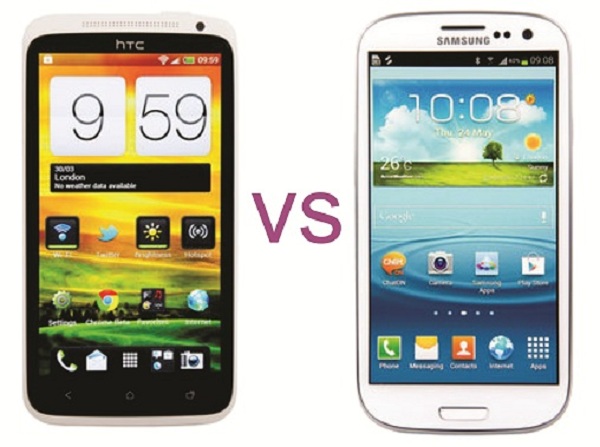
Last week, I had the opportunity to spend a few days with a Verizon model of the Samsung Galaxy S III. While this quick run-down is not nearly as deep as the Vellamo review posted earlier today it is a good perspective on the surface of the GSIII and how I compared it with my HTC One S. Here is what I liked and did not like on the phone and most of these things are user interface quirks that showed me how junior Samsung is compared to HTC in the user experience.
This phone has a great lock screen and also the display is very crisp. I like the visual effects and the viewable info from this screen is handy, but as soon as you as you add a form of security you lose the screen. It seems like the person working on the lockscreen did not really work with the person coding the security features or it was put on the back burner to focus on the blink feature in the face unlock feature. Sense does the security page after you open the lock screen. One thing you lose on Sense with a security unlock feature is the ability to drag down the notification bar. I noticed I could drag down the notification bar on day one with my One S, but I lost it as soon as I turned on a pattern to unlock.
The camera app is very bloated. The quick adjustments on the left side are too big and I do not know what half of the icons are unless I go into the full settings view for more details. It does seem like there are quite a few options and I like that I can rearrange them putting ones I might use the most on the front line.
Adding apps to a new folder on the homescreen takes extra steps compared to Sense. With Sense all you do is drag an app over another app, let go, and boom you have 2 apps in an unnamed folder. On the GSIII I had to go to an empty piece of real estate on the homescreen, long-press to get to the menu, and then select New Folder. From there I would have to navigate to the apps I wanted in this folder and drag each one over. It is a tiny complaint, but the ease of use on Sense has me spoiled! Also, if you want to drag an app to a specific spot on a homescreen tile and there is already something in that spot the GSIII’s UI does not allow it to move over for the new app.
Adding widgets to the homescreen is different, but I can relate to the logical approach Samsung took. If I remember correctly, you have to open the app tray and toggle to widgets. This is not too bad, but different from what I am accustomed to. I think HTC took a step back when they removed the Personalize option from a long press on any empty homescreen area. Instead the quickest way I have found to get to it on my One S, short of an icon on the homescreen, is to pull down the notification bar and go to Settings > Personalize.
I like that you wake up the phone from the physical Home button. I did not noticed this at first, but my nephew tried it and said, “Oh, it’s like my iPod.” I raised an eyebrow and all the lawsuit shenanigans made more sense to me after that.
One last thing, that great screen I mentioned earlier also contributed to the rather quick drain on the battery I saw. “But at least it is a removable battery” someone is saying right now as they read this.
All in all the Samsung Galaxy S III is a nice sized phone with a crisp screen and some good security features (though rather under developed, if you ask me). I am just too comfortable with my HTC One S and I think the user experience is much nicer than the GSIII. Sorry to post such an opinionated article against the family of Android phones, but I think this phone got a little too much hype than it deserved.
Photo from: HTCPhones




This is a good article.
Maybe, the next time, you should add screenshot to show us ?
Personnaly, i am too attached to Sense. When I use another Android Phone, it’s more difficult… Not so easy .
Maybe the habit ?
Samsung Galaxy III looks nice, it is slim. Yet as you stated I feel that HTC phones UI is much better and less complicated with a low learning curve. The HTC one and the X feel better in the hand than the galaxy. People state the speed of the Galaxy 3 is faster, I think it depends on the network you are on and where you live and where you are. I’ll stick with HTC.
Because The SIII looked really good on paper and because I’d really like to have another phone with a OLED-screen I spend about an hour in a mobilephoneshop “playing” with the SIII and the HTC One X.
I learned two things in this session:
1. I prefer HTC Sense because its easier and more inuitive to use then the Samsung Android usersurface. All the things you wrote above I completely agree with. HTC is just a lot better in the details which ads up to a much more satisfying user experience.
2. The LCD Display of the HTC One X is a piece of candy. Exceptionally crisp, beautiful colors and good contrasts. The OLED of the SIII still is the better display, but there is not as much difference as I had expected. The One X LCD-display is definitely better than the OLED-display on my old HTC Desire.
So my favorite for now is the HTC One XL, which shares the excellent screen with the One X, but has the better CPU (faster, less hot and more stable) and LTE. Just now I’m trying to decide if I should wait for the 5 inch fullHD phone with 480ppi screen or take the first good offer for a HTC One XL. I’ll probably buy the HTC One XL though, because an Update is long overdue…
I agree you say about the physical home button, wake up the phone from the physical Home button is one of the advantages compare to others. However, when it come to jellybean, things get different because every android phone (include the one series) will be able to access the google now via home screen button that samsung phones cannot access to. Which means SGS3 users cannot access google now without the icons or widgets, which is very troublesome tho
This is how you unlock your One X …with Sweep2Wake Bricked Kernel