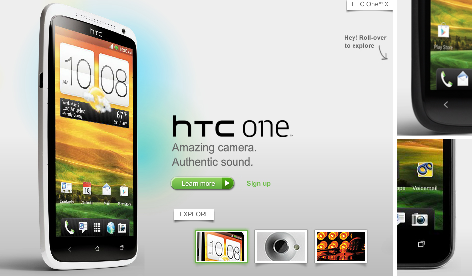
HTC has decided to re-launch its U.S. website just days before the first HTC One phone is released in the United States. The new design allows HTC to highlight its phones and tablets a little more and makes it easier for potential customers to sort through HTC’s phone offering by filtering them by carrier and even matching them up to compare multiple devices side-by-side.
It’s nice to see HTC spruce things up a little, but we honestly think it would have been better if they just used the design they already have in place for their international site. If they want to deliver a unified brand experience with the HTC One and HTC Sense, they should do the same with their sites as well.
What are your thoughts on the new design? Does the new look capture the essence of the HTC One series?
