HTC Sense 3.5 may not be a huge leap forward, but it does bring some noticeable changes to HTC’s custom UI. Leaked images of Sense 3.5 seemed to raise quite a few questions. While we don’t have the answer to all of them, a new video just might. XDA.cn has just uploaded a video to their YouTube channel which gives us a five-minute look at the new UI changes running on the HTC Bliss and how things are different in the latest version of Sense. Anyone who’s already played with the HTC Sensation or HTC EVO 3D will find most of the tweaks in Sense 3.5 to be simply cosmetic.
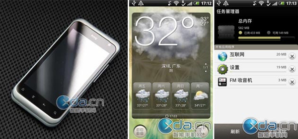
The biggest difference between HTC Sense 3.5 and all of its predecessors is the drastic change to the launcher on the home screen. Rather than having a bar that spans the bottom of the screen, HTC Sense 3.5 has two circular buttons in the bottom left and right corners which open the app drawer and phone dialer.
What do you think of the new HTC Sense 3.5 and the HTC Bliss? Is HTC’s UI progression heading in the right direction or do you think the new tweaks make HTC Sense a little less intuitive?
Source: XDA.cn


