I’m going to preface this post with a quote: “A Computer on every desk, and in every home, running Microsoft Software” -Bill Gates, 1986
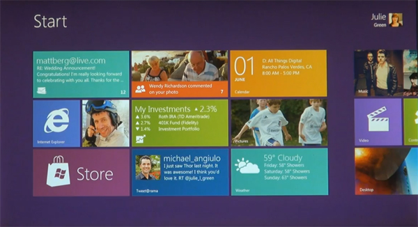
No one at the time, would have thought that you could add to that quote today, “In every courier bag and pocket”. With Windows Phone, Microsoft moved away from an Icon based menu/ interface, and it’s revolutionary. In a way it combines Icons and Widgets into a fluid list based, straight up and down UI. It seems though, that Microsoft, have taken another arrow from their Metro quiver, with the preview of Windows 8. Seeing the proposed user interface, you can only determine that there is a trend developing. with the preview of Windows 8 today, we actually get a hint of where Microsoft is going forward.
Microsoft is trying to definitively change the way we think about the PC with Windows 8, and I believe, is turning to it’s”always on” criteria, that it launched with WP7, to revamp, and make touch friendly, across all of it’s devices. All in all, I have to say, this is a very brave move from MS, attempting to revamp what has become iconic, redesign the user interface of the most used operating system in the world. While Microsoft have continually updated the OS, this is the first time they have radically altered the way customers interact with their OS. Be sure there will be a backlash, but where you gonna go, buy a Mac.
I think it’s a bold move, and a great way to make us think about how we use our devices, how much software is installed on your PC/Tablet/Phone that you never use? In a way, it seems like Microsoft are offering you a way to make your PC experience, more personally insightful, and communicative. This only makes sense, if you take into account the way Windows Phone works. quick in, lot’s of information, quick out. All the things that you need to pay attention to can be put in one place, and accessed with no drill down. You don’t have to think about menus, just go in to a pinned app from the start screen if you need to.
More importantly, Windows 8 is spearheading a revolution in user interface development, and will change the way we use a PC.




Ok, I don’t have tasted a windows phone yet, but how different are gadgets in android to gadgets in windows phone? android has icon but also there are widgets you can put in one home screen
Hey Fernando, primarily, the gadgets, or widgets on Windows Phone, are actually live tiles, just like in the windows 8 preview, obviously, there is less space so they display less info. but an active live tile is an indication that there is activity in the application, and therefore draws you to it. The tiles are presented in one home page, in a list format, instead of a multiple homepage format. The experience is a lot cleaner. More direct