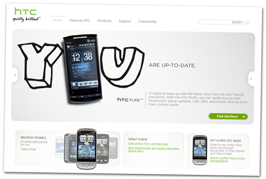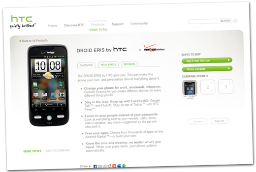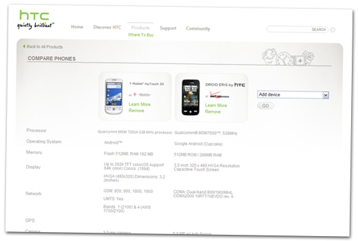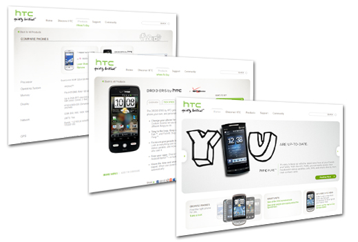
Apparently HTC was not satisfied with their little website makeover a few months ago. The U.S. website has just undergone a complete overhaul in order to offer visitors a much better user experience. In the past, HTC has had minimal phone detail on their U.S. site, forcing users to scramble through HTC’s sites for other contrived in order to find more picture or full spec sheets. Even when you were able to find information, it wasn’t always right since most U.S. released HTC handsets have undergone some serious transformation. Now you can simply click on the “products” page and you can view all 26 HTC handsets available for sale in the U.S. market (keep in mind that the 26 handset number includes all multiple variations on HTC phone on different carriers). One you click on the handset you are interested in you’ll be treated to a details product page with images, specs, and even links to reviews. HTC has also created “product experience” videos for most of their newer handsets. You’ll also be able to compare multiple HTC handsets and see which one would be best for YOU. To top things off, HTC has included direct links to all the various carriers so that you can check out pricing and rate plans and make your purchase.
I was excited when the site got a face lift when the YOU campaign kicked off, but HTC has really stepped up their game. All of their ads are driving traffic to the site and now the site should be able to drive sales for their handsets.
