Late yesterday, a ROM dump of the HTC Nexus One made its way onto the web. We’ve seen a few pictures of the phone itself, but now we have a little peak of what the UI will look like on the new Android 2.1 build. If you’re thinking that things would be pretty much the same as Android 2.0, you’ll be surprised to know that you are sadly mistaken. Apparently Android 2.0 was destined only for the Motorola DROID and did not include a lot of the enhancements that Google has saved for 2.1 phones.
App Drawer
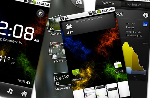
The first thing that you’ll notice on the Android 2.1 build is the new app drawer. Android has apparently ditched the little tab at the bottom of the screen in favor of 4 x 4 square button which his accompanied by two dots on both sides (we’re guessing that the dots represent your position on the new 5 panel home screen). The app drawer itself has also undergone an extensive redesign. As you scroll through your apps, they will roll out from the bottom of the screen and curve around the top. This change doesn’t add an additional functionality to Android, but it does step up the visual appeal quite a bit.
Home Screen & Widgets
Google has slowly been adding and tweaking widgets with every new build of Android. Android 2.1 offers a redesigned black Power Control widget (which we saw already on the Hero 2.1 build) and a new Weather/News widget. The new widget scrolls through the latest news stories while giving you readout of your current temperature. Clicking on the widget will open up the new News and Weather app that’s included in the 2.1 build. Once inside the app you’ll be presented with multiple tabs (Weather, Top Stories, U.S. News, International News, Sports, and Entertainment). The Weather information is pulled from weather.com and I’m assuming all the news comes from Google News.
{gallery}android/2_point_1{/gallery}
The last notable change we spotted on the home screen is the addition of a card like system (think of the card from the Palm Pre). The cards are show up at the bottom of the screen, right above the app drawer button. From what we can tell, the cards show a visual representation of the five home screen panels and should allow you to quickly jump between panels.
Media Gallery
Like with Widgets, Android has seen some gradual improvements to its gallery app over the past few builds, but it was still lacking the visual appeal that the competition offers. Fortunately Google has chosen to give the Media Galley a facelift. Now when you open up the app you’ll see a blurred background with stacks of Polaroid images from your different image folders on your phone. Once inside an image folder you can select how the images will be displayed (grid or stacked). Google has also included a button for the camera on every single screen just in case you need to take a picture right NOW.
From what we’ve seen so far, Android 2.1 is a great improvement over the 2.0 build. The additional features, tweaks, and added visual appeal seem to give Android just a hint of sexiness which has been lacking from the start. Keep in mind, most people don’t care about what a phone OS can do, they mostly just want it to look pretty so they can show it off to their friends.
Source: Engadget