As a follow up to my Flyscreen review, (although its been a while) I figured i’d do a short review of Buzz Deck, Flyscreen’s cousin/rival.
Buzz Deck offers much of the same features as Flyscreen, give or take a few, but it is mostly mobile webpages consolidated within the app. You won’t find a calendar, or SMS ‘card’, but you have great RSS feeds and sites from the get go at your disposal. So, if Flyscreen wasn’t your thing, here is a great alternative if you didn’t like your lockscreen stealing the show!
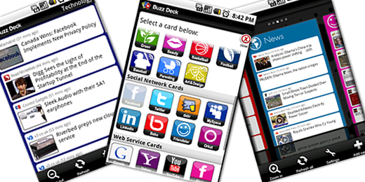
With a UI similar to Palm’s WebOS (although omitting WebOS’ polish), the app uses ‘cards’ that you can add, remove, whatever. The cards are broken into certain sections, Social Networking, News Stream, Web Service, and Custom Cards, which allows you to add any website, and if available, will automatically put it into the mobile version. So whether its Facebook, Twitter, tech, sports, or celebrity gossip.. Well, there’s a card for that. There’s a card for just about anything, but not necessarily only on Buzz Deck. (may the Apple flames begin!)
One thing that I love about this application in contrast to Flyscreen is, well, that it’s an app. I dont have to see it if I dont want to, and I wont get annoyed with it after a few days. Although you can turn Flyscreen off, once you install it, you’re pretty much stuck with it. It may do wonders for the lock screen, but I can choose when I see Buzz Deck, and that’s something I like. I do however recognize that Flyscreen is meant to be more flashy, as it uses widgets, and not mobile sites, but both do their job, and well at that!
Since this application boasts less than Flyscreen, I expect less from it. This is not to say that the potential is not their though. I’m actually surprised that this app wasn’t around sooner! We have apps that consolidate contacts, messaging, etc. together, but why not all your favorite sites in one app. (and no, the ‘bookmarks page’ on the browser just doesn’t do it for me.) As An Android user, I’ve come to expect the glitches from apps, so I can only be ok with some bugs here and their with an app that I see so much potential with. I have yet to witness any force closes or bugs with Buzz Deck, but I did encounter a few with Flyscreen, which have porbably been ironed out by now.
The interface is clean and simple. You are presented with cards that you can configure to your liking. Once you choose your cards, they will be refreshed within the time you’ve allotted them in the settings, and you can manually ‘refresh all’ right on the main page. ( helpful if your in a hurry!) All interaction with a site or RSS is kept within the card and a dedicated option to zoom in or out of a card is always present. There are lots of interesting feeds to choose from, and i believe that there are more options in this app compared to Flyscreen, though I may be mistaken.
How do the two of these stack up to one another? Well that depends on what you want. I must say that I would prefer Buzz Deck over Flyscreen, but for no real reason. Both are great apps, but i’ve really turned into a twelve year old girl when it comes to Buzz Deck. What it lacks in flash is made up for with functionality. Its simplicity makes me yell at others for not having done this sooner! (or me at that!) Buzz Deck and Flyscreen are both available in the market, and are both free, I suggest you try both and tell me what your personal opinions are on the two.
{gallery}/android/apps/buzzdeck{/gallery}


