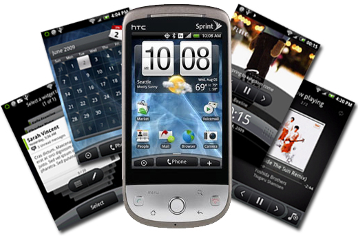
The HTC Hero undoubtedly dons features that the public wanted and that its predecessors lacked. However, do these new features make up for the new issues that this device has created for itself? In my opinion: No.
I won’t take too much of the reader’s time here to discuss the basic features of the phone, since that has obviously been covered repeatedly by other sites. What I will do is discuss the hidden highlights and downfalls to this new device that brings Android to Sprint.
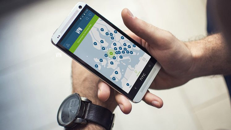
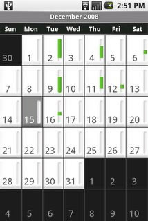
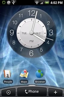
For those who are heavily involved in social media… this phone has you covered. The HTC Hero includes integrated Flickr,Facebook, and Twitter apps with widgets. Additionally, for each entry in your Address Book, you can include the information for these services. This provides an easy way to check when a friend or person of interest has updated one of their social media profiles. Not only are your Contacts infused with the social media sites, but also their SMS and email, making contact management extremely easy. On the Hero the user will also find an improved Calendar application. The Calendar itself now appears crisp and modern, as opposed to blocky and white like it is on current Android phones (the Dream and Magic). The overall appearance of the UI (Rosie) is without question more polished than previous versions. On the main desktop, a convex bar appears at the bottom offering quick access to important areas of the phone (i.e. the dialer–imagine that). The top of the phone features a 3.5mm headphone jack, finally! And remember that annoying battery cover on the Dream that was abandoned for something slightly better on the Magic? Well, luckily HTC kept on that route and altogether abandoned it for the Hero.
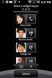
All of these new features are great but many of them have downfalls which cannot be ignored. The integration ofFlickr, Facebook, and Twitter are handy when you’re someone who wants to use them for every contact you add, but what if you don’t? You still get asked for this information as you’re creating a new contact (with no option to disable), and the device kept asking me to login to those sites whenever I tried to add a new entry to the "People Widget"–a name I find kind of creepy (I guess "Contacts Widget" wasn’t good enough?). As for the calendar, the Android widget still looks the same–boring white with gray inlay bevel along the edge–but it serves its purpose; the HTC Calendar widget looks much better but it’s also much bigger. As for that convex bar along the bottom of the screen, my basic thoughts are: why is this necessary, or why can’t it be disabled? I mean, I do find it such a bother to press the green phone key and was hoping I could waste already limited screen real estate for basic phone functions instead! Additional downfalls include (but are probably not limited to): the back button being in a very awkward spot for both portrait and landscape modes, the placement of the USB charger (still in the way of your hands while trying to type when the cord is plugged in), lack of landscape support for integrated apps, and the full-screen browser. The last two may not sound like such a big deal, but I promise, they are both incredibly annoying.

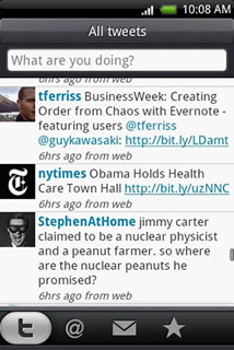
When an app is developed, hopefully the creator keeps in mind the device they are designing it for. That does not seem to be the case with the integrated apps on the HTC Hero, since some are lacking landscape support. In any application where the main focus is typing in an update (a la Twitter), landscape support is crucial. It might only be 140 characters or less, but what about the fact that there is no hardware keyboard? The user no longer has the option they did on the HTC Dream to flip open their keyboard and type in their update. I sure hope the new Hero owners love portrait mode, especially with INTEGRATED apps not even allowing them to use landscape. As for the browser, full-screen sounds like a good thing since there is such little screen real estate to deal with, right?
Wrong. The full-screen leaves the user unable to see the notifications bar. So that means while you are surfing, if you get any SMS, email, Twitter, Facebook, Flickr or any other kinds of updates, you are forced to close the browser to see them. Perhaps this is a flaw that will be fixed in the near future, but I haven’t seen enough fuss about it yet that would motivate someone to remedy the issue.
Despite all of these pros and cons for the user, the HTC Hero is definitely on the pro-list for Sprint. Prior to the Hero, Sprint had zero Android platform phones. For now, they are limited to the Palm Pre as their crowd-catching device. Unlike T-Mobile, which is offering up over 10,000 apps to choose from for their users, Sprint has a tiny and forgettable selection for apps on the Palm Pre. Will this addition of the HTC Hero secure a position for Sprint in the Android device market? Some say yes, but I think those who really wanted an Android device already packed their bags and went to T-Mobile to obtain one.
