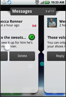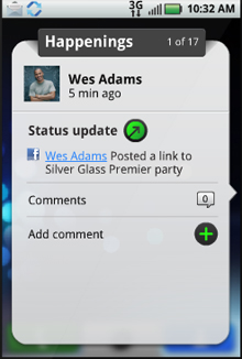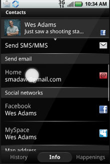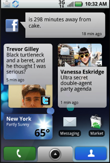
Like many of you, yesterday I watched Motorola’s Keynote presentation in which they revealed MotoBlur and the Motorola Cliq. While many people are excited to see a new Android powered phone from another company, my real point of interest is the MotoBlur integration into the Android OS. Motorola is positioning its custom software integration as a means to stay on top of your social networking life. MotoBlur integrates all your messaging (email, sms, Twitter, Facebook, and MySpace) all into one and allows them all to surface on the Android home screen through various widgets. It also allows you do to merge all your contacts from all your various accounts all into one so that you don’t have to spend the extra time trying to track down someone’s information.
Complete social network integration is really what MotoBlur is all about. From what I saw from the keynote speech and a good thirty minutes of playing around with the MotoBlur interactive demo on their website, it does an incredible job of keeping you synced up with your friends. Probably the coolest feature I noticed is that when you receive a call, your contact’s latest status updates shows up on the screen before you answer. MotoBlur also includes a widget that allows you to update your status on all your social network accounts with a simply click and you can even view what music your friends are listening to on last.fm.
Unfortunately, it seems that MotoBlur stops there. While HTC Sense gave all the basic Android apps a facelift and improved functionality, Motorola has chosen to leave almost everything in tact from the standard Android build except for a few graphical changes to the app drawer, status bar, and standard Android widgets. The Motorola Cliq features the standard Android music player, media gallery, browser (with no Flash support), clock, Though I don’t own the HTC Hero, I have thoroughly enjoyed the Hero build on my G1. The HTC Sense Widgets that are included are simply stunning, allowing me to choose what I want my phone to look like. In contrast, the MotoBlur widgets look a little plain, especially their weather widget.
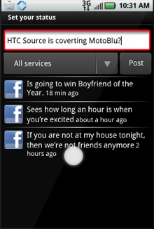
Therese Poletti from MarketWatch notes that simply pushing a social networking selling point for the phone could be risky since you would alienate potential customers who don’t really care or want to be connected all the time. I would say that I have to agree. The demographic of the Motorola Cliq seems to be aimed right at current T-Mobile Sidekick users. So if you’re not between the ages of 12 to 17, you’re probably not even going to be taking a second look at the new handset. At first glance, having all your messaging in one spot sounds really convenient, but do I really want to mix Facebook messages with my work email, or my blog Tweets with a text from my wife? Some things are separate for a reason.
I’ll admit we still have not seen the complete picture of what MotoBlur will look like. The Motorola Cliq is still months away from shipping, so things could change before the handset hits the streets. HTC Sense does have some social skills of its own, but HTC has chosen to sort things by contact with Perspectives rather than sorting things by messages. I guess you can say that I’m not completely sold on MotoBlur. I was hoping for a little more. But there’s a silver lining is all of this. MotoBlur is the first challenger to HTC Sense. A little competition is good for everyone, especially us, the consumers.
