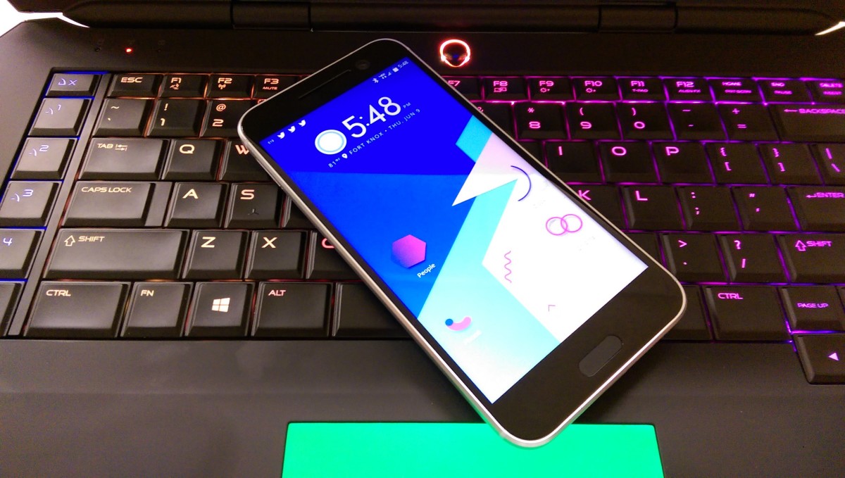


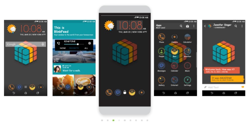
Welcome back to the HTC Theme of the Week! This time I’ll be covering an illustrative theme that honors a classic piece of children’s history. The Rubik’s Cube was an ingenious toy designed in 1974 by a Hungarian sculptor. The Cube theme features a cube in the center of the wallpaper that somewhat resembles a Rubik’s Cube. The cube in the wallpaper has too many of the same colors in the wrong places to be a copy of the Rubik’s Cube, but maybe that was a precaution taken by the person who made the wallpaper.
Just like the theme title, the description is minimal as it simply states, “theme cube”. The entire theme has a minimal feel to it. One item on the wallpaper, all the icons have the same round appearance for a clean look, and the color scheme is very calm.
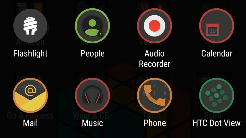
There are several things I like about the Cube theme. For starters, did I mention all the app icons have a common appearance to them? There are a few custom icons like the default set of HTC apps. Those all have some nice touches to them. Look at the Phone icon below, it has the dial pad behind the main icon image. And check out the Email icon, behind the “at” symbol you can see little lines of text that look like a written letter. The Audio Recorder app is almost a little out of place. The red dot appears to have a shadow leaning down and to the right. It reminds me of the icons from last week’s theme, but then I remembered that’s just what the Audio Recorder app looks like.
That minimalist feel of the wallpaper puts me at ease when I unlock the phone and navigate to my apps.
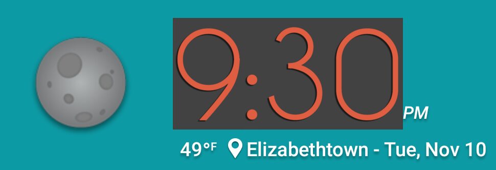
The weather icons are also a pleasure to have around. I like the details of the weather icons, because they have a simple design that doesn’t distract you from the rest of the theme. The moon has a little shadow behind it and it looks well up against that blue background on my BlinkFeed.
The clock area is a little busy with that out of place solid block of gray surrounding the numbers that I don’t like very much when it is static. It’s when the time changes that the true detail of the clock widget is witnessed. Each minute that goes by, flips the number on the screen with a nice animation adding some value to that previously stale, solid block of gray surrounding the numbers.
I kind of wish this theme had some tones to go with it although I don’t know which sounds would be a good fit for the this theme. More theme designers should try to incorporate at least one sound when they work on a theme.
Go that extra mile people! We will applaud your efforts.
Honestly, my ringtone, alarm, and notification tones are all still set to the Arrow theme I covered, because none of the themes since then have had sounds and I’ve been too lazy to manually change them.
The Cube theme was designed by Dario Scardy and was added to the gallery on November 3rd. Since being added this theme has been downloaded over 15k times so I’d say it’s a hit with the community. What do you think? I’ve enjoyed having this theme on my phone for a week. What type of theme should I cover next?
Theme of the Week: Cube