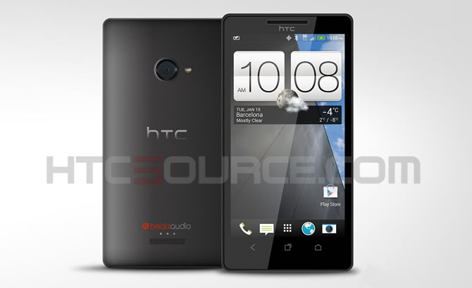
Ladies and gentlemen, we present to you the HTC M7. Last week, an image was making its way across the web which many believed to be a render of the upcoming HTC M7. While the source of the image claimed that it was pulled from an early firmware build of the device, one of our sources (who has spent quality time with the HTC M7) said that the image did resemble the M7 in any way.
Fortunately, yesterday afternoon, we got a tip from one of our readers (thanks neo) which led us down a bit of a rabbit hole. After countless dead ends, a half dozen emails and help from our trusted sources, we were able to dig up the image above. Two trusted sources claims that this new render is an accurate depiction of the HTC M7. Unlike last week’s render of the phone, the new image matches up with the one blurry cam pic we saw of the HTC M7 during CES (mainly the straight lined speaker grill and placement of the HTC logo above the screen) and the iconography also matches the leaked HTC Sense 5 screen shots. We are told that there may be some slight cosmetic differences (mainly coloring) between carrier branded versions of the HTC M7, but the overall look and feel of the device will be globally recognizable.
The design of the HTC M7 should look familiar since HTC has pulled in a lot of the accents from the HTC 8X. We originally thought that HTC wanted to keep the deign language of its Windows Phone and Android devices separate, but HTC apparently decided against it.
What are your thoughts on the design of the HTC M7 and the new render of the device? Do you think HTC’s design team is moving in the right direction?
I don’t like the design. It lacks spirit, it’s not memorable, it’s boring.
I _much_ prefer the slightly curvy design of One X (which I own).
This aside, The buttons at the bottom – are they capacitative, like all the old HTC phones, or (finally) on-screen? I can’t tell from the image.
Actually after closer examination it looks like the buttons are (still) capacitative.
That’s really disappointing.
More and more I think my next phone will be a Nexus and not a HTC
yes please get the nexus and stop bitching
Yes, how dare you have an opinion kko.
Our source confirmed a while back that the buttons are still capacitive.
cheers,
although I’m disappointed.
I really do hope this is fake or early iteration and not the final design
I like Sense 5 – it is really classy/refined/high-def if you take a close look, especially the subtle shading. I think HTC wants to make Android look a little more like WP8…bigger surfaces, less BLING, less edges (launcher from wall to wall).
As for the phone design, it seems aimed at business users opting out of WP8, which is nice for Android, since there are few Android phones with such a slick, masculine design (well ofc the differences to many Android phones are not HUUUGE, but this one seems very tight).
Personally I’ll wait for that model with more personality, like the One X has.
DAMN IT! No kickstand. </3
get a case with a kickstand or get sprints version /story
I’ve never had or needed a case for my phone and cases are bulky and ugly and I shouldn’t have to buy a case to have a kickstand. I am on Sprint and REALLY hope the Sprint version gets some different hardware specs.
Looks good! Especially if the screen turns out to be as good as all the rumors are saying.
Am I the only person left in the world that prefers capacitative buttons? I’d rather have buttons on the bottom of my device than taking up precious screen real-estate all the time. I’m happy to see HTC stay that way.
That’s just me, I guess.
What? How do soft keys take up more screen space? Assuming you make a phone with a given physical size, you either have, say, a 4 inch screen and .3 inches of physical buttons, or a 4.3 inch screen with software buttons.
Have you tried the Galaxy Nexus, Nexus 4, RAZR M, RAZR HD, etc.? The advantage is obvious. So obvious that the Xperia Z and the Galaxy S4 are doing it too.
When you see how large they had the make the M7’s shell to fit a 4.7 inch screen plus hardware keys, I think you’ll agree.
What advantage? That you get a smaller casing, at the price of a smaller usable screen? I have a One X, with a 4.7″ screen and capacitative buttons, and I’ve handled the DNA many times, and in neither case did I find the phone to be so huge that I thought they should have used on screen buttons and given me less screen space so the phone could be smaller. If you want a smaller phone, then get a smaller phone. If it has a gorgeous 4.7″ screen with the rumored 468ppi resolution, I dont want .3″ wasted at the bottom of my phone.
And yes, I’ve seen and played with the new Razr’s and the Galaxy Nexus. I don’t think I’ll agree.
Sorry for disagreeing.
I totally agree with u … I hate on-screen buttons …
Same here. On screen buttons take up screen real estate and you’re losing part of the screen. If your movie is paused, the buttons will cover up your movie. I would rather they made the screen smaller and added capacitive buttons to it.
Making the screen taller and using that extra space for on-screen buttons, won’t the aspect ratio be very “tall” when using the whole screen for content, such as video? If it has to be on-screen buttons, at least make the whole phone shorter when you remove those off-screen buttons.
And maybe that’s it – HTC sees that it’s a plus to have som space below the screen anyway, for ergonomic reasons – I mean, even iPhone and Samsung G3 has a button below the screen which places the screen further up on the phone…why then not have two extra buttons, beside the noob-button, that eliminate the on-screen buttons?
The design is too simple, nothing much different about it. It is simply a variant from HTC Butterfly and droid dna. I hoped for more radical design.
That’s why i would prefer something akin to the first render we saw last week…it has a radically new design just like the new design we saw when the One X came out. I will also hope HTC will not CEDE any ground spec-wise to the Samsung Galaxy S4 which we all know will come with every imaginable spec desired by most of the masses. I am afraid they will not respond point for point on the debacle of the One X. Even though this device is rumored to have monster specs..i see them leaving a few out which will again give Samsung a leg up. I say include all the specs that ppl have been bitching about…so they will have no excuse to skip the device. As per the device being on all major carriers..i see HTC not doing a repeat of the One X.
I really dont like the look of it. It’s so…..flat……
i would prefer the build of the HTC Butterfly over this anyday.
I really preferred the One look, with perforations for the speakers and a scalloped shape to the body. The One S’s curved back is fantastic in hand. This is pretty generic.
I think I’m starting to come around to onscreen buttons, especially now that we can’t feel confident that HTC is always going to allow us to long-press the multitask button as menu (didn’t the Droid DNA disable that feature?). Mostly it’s because I find it too easy to push a button while handling the phone or handing it off. I want some space to grip.
those are capacitive buttons, what are you talking about?
I mean I would’ve liked to see onscreen buttons instead.
some lacked specs claimed that HTC M7 would have two stereo speakers but I only see one in this image.
That was based on the last render which is obviously not the real HTC M7
It looks like a black One X but its corners are not as rounded.
One very interesting thing about it is that the home button has moved to the right and the app switcher button is now in the middle. Why would they do that? I’m also disappointed they didn’t include the Options button. I hate my apps having an extra line on screen with 3 dots in it.
They could combine the app switcher into the home button like Sony does. When you hold down the home button, it activates the app switcher, saving you a button and making room for an options button.
they do that with the task switcher button. you can also assign “options” or “right click” as I call, to the task button. but having it in the middle is just stupid
How do I do that? I have a One X. Where is the option to replace the task switcher with an options button? Will this get rid of the 3 dots in my apps?
first make sure u have htc updated with android 4.0.4 or 4.1.1, then go to settings->display, gestures, and buttons, then look down for “button” then “recent app button” then switch to your liking!! 😀
OH MY GOD! THANK YOU!
I love you so much!
its ugly. it looks like a windows phone/xperia wannabe. i think HTCs doing it wrong. very wrong…
but then again, i also thought the S3 was ugly (still do. i think the S3 is even UGLIER than the render shown above).
It went out to be the best selling, (ugly and cheap looking) android phone of 2012. ewwww.
if this is the m7 then its over for htc
The front side looks very interesting. The back, not so much.
it is one of the worst designs by htc EVER! nothing attractive or professional about it. And is this the real sense 5?? no positive changes (in appearance at least)? the stupid battery is still green and (clock) widgets look to be identical to 4+. the only change that i see in sense is turning the icons to some stupid cartoonish icons. i doubt people in htc have such a horrible taste!
Peace out htc… If you are hiring, there are a lot of people who could help… That is one ugly unimaginative phone. Prepare to be demolished by the sg4.
The one x was a nice device, they should have started from there… This is a step backwards… Geez the dna is even better.
Too bad, I really was fond of htc and was really hoping the m7 was going to be my next device…
Err.. this looks just like the One X but black.
I’m loving the look of the HTC M7. Those bitching about design have probably never held the HTC 8X. Pictures simply don’t do it justice. The feel of the phone is simply amazing, the curved back is feel a lot smaller than it actually is and I’m assuming the M7 will carry that over.
Great job HTC!
im not feeling the way that phone looks.. its shape sux 🙁 i love HTC im an Evo lover! i have had all of them so far..
I hope this is not the htc m7 or else htc just lost a customer.. This phone is uglyy, hate how they chose the design from the 8x and not the one x
The phone has a minimalist look which is not a bad thing. Hoping for a smaller footprint, killer camera and fantastic screen. I have the DNA and Iphone5, both are great phones but I prefer Android with larger screens.
M7 may be my next phone.
Keep those rumors coming !!!
Not what I was expecting. Very bland look for a HTC phone with squared corners. And again with the capacitive buttons? Not that I need another phone, but if this is the final design, it’ll be easier to save some money.
Really disappointed in HTC and not going to give them anymore money til i see QUALITY updates in a TIMELY manner for their devices. Jelleybean was promised for the ONe x and S in OCTOBER. We finally see it for the S in December and it FN BLOWS. Batterylife is MISERABLE (HUGE step backwards IMO).
Cool device, and i belive that if its available on all 4 carriers it will sell and be a big hit for HTC, but until i see better support F-UM. I will give my money to someone else.
And WHEN IS HTC GONNA GET RID OF ALL THAT DAMN GINGERBREAD GREEN??!??! ITS DONE!! GET OVER IT!!
Remember Htc would stay with green as it just sets them apart from everyone else. Their logo is even green, and should they change that as well? I think they just like green(as you can see by their logo) and will probably stick with it for some time.
Also the next version of android might have green back again if it is indeed called ‘Key lime pie’…
Looks fake to me, that’s the back of a HTC 8X !!
Why is the home button been moved from the centre ?
This is in no way a final design. Did no one notice the front camera is missing?
Also, stereo speakers were rumored before the previous render surfaced. I would like to see them do two front facing speaker grills and a kickstand for a nice hands-free viewing experience. They would probably use on-screen buttons to make room. Ido prefer capacitive buttons. When a prog refuses to respond, you still have a shot at regaining control.
The first real images is out on the net. Please HTC source update it…
http://www.androidpolice.com/2013/01/20/exclusive-this-may-actually-be-the-htc-m7-with-sense-5-0/
Also I like the look of the phone and the new sense. Looks more clean, more modern and “less bloat” as most reviewers would like to call. Only gripe I have is with the soft touch buttons where the home is to the far right.
Htc doesn’t get it