


This week I bring the focus back to a material designed HTC Theme with the Redding material theme. Android design has a lot of influence on how our phones look these days. It’s not like the old days when custom user interfaces like HTC Sense were in high demand due to the lack of appeal of stock Android. There are some good HTC Theme designers who understand that people like a near stock experience and are able to deliver.
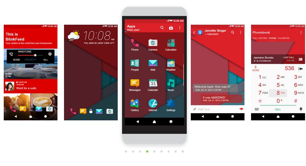
The Redding material theme has a nice warm color palette. The main wallpaper has a dominating red color that shows up in BlinkFeed and several icons draw from the other colors on the wallpaper.
Speaking of the main wallpaper, the main wallpaper is the same for the lock screen, home screen, and messaging screen. The only place I noticed a different wallpaper was on the HTC Dot View screen.
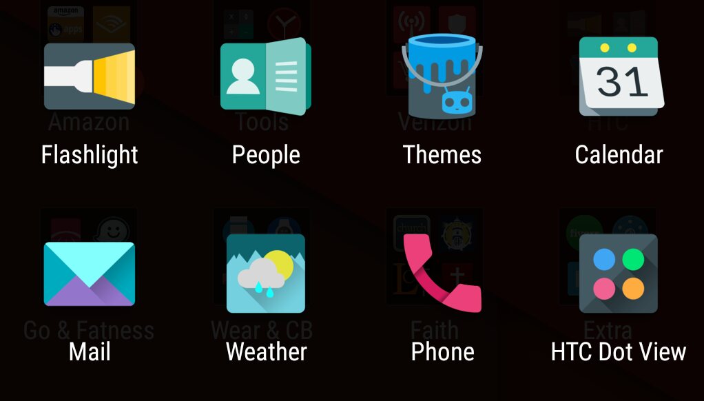
Common app icons are customized in the Redding material theme, but as I pay more attention to them it seems like some are material and then a few have more 3D elements that don’t translate to material. As seen below, Flashlight, Mail, Weather, Phone, and HTC Dot View fall inline with the direction I think the theme was supposed to be headed, but Poeple, Themes, and Calendar look more curvy than the others.
The Redding icons are still attractive collectively and if there were a way to apply a similar style to the rest of the installed app icons this theme would make my day very happy. When it comes to theme design it’s best to have a handful of custom icons and the rest default versus all default icons.
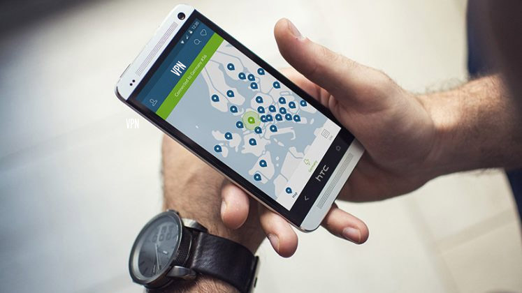
I really like the red color on BlinkFeed! Although my favorite color is blue, I am drawn to bold red colors. I even downloaded a luscious red keyboard theme for my Swype keyboard to go with this theme.
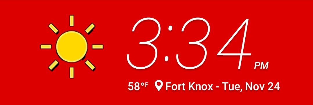
Also on my BlinkFeed page is the HTC Clock and Weather widget. Surrounded in the red I’ve been talking about are the thin white numbers for the clock with the date, location and temp details listed below. Then there’s the weather icons, these are mostly in the color yellow and were kind of an eyesore to me. Even the moon is yellow, but there isn’t any yellow anywhere else in this theme. White or gray would have been better than the color used in the weather icons, but there are times when a designer need to be different and following the inspiration is what makes Redding material so unique.
I was disappointed that the Redding material theme didn’t come with any audio clips for the notification, alarm, or ringtone, but then again most that I’ve reviewed with tones have fallen short for one reason or another.
This theme was created by Laszlo Tamas Bader, a designer that I’ve covered before. It’s hard to stay away from Laszlo’s designs, because they are so attractive and full in detail. The Redding material theme was added to the HTC Theme gallery on November 10th and has already been downloaded over 12,000 times.
Theme of the Week: Redding material